
Seven keys
Part 11 of 15 of ./blog.sh v1.0
There is not a single colour value in this site's stylesheet.
Every colour you're looking at right now — background, text, links, the navigation, the little tag pills — comes from seven keys in config/site.yml. The build compiles them into a colors.css file, and site.css just uses the variables. Change seven lines, rebuild, and the site is someone else entirely.
Here's a complete light-mode palette:
colors:
  light:
    bg: "#f5f8fa"
    text: "#444a5a"
    meta_text: "#657784"
    accent: "#1da1f2"
    nav_bg: "#eaf5fd"
    border: "#e1e8ed"
    pill_bg: "#d6ecfc"
And here's the same homepage in five palettes — nothing changed between these shots except seven lines of YAML and a rebuild:
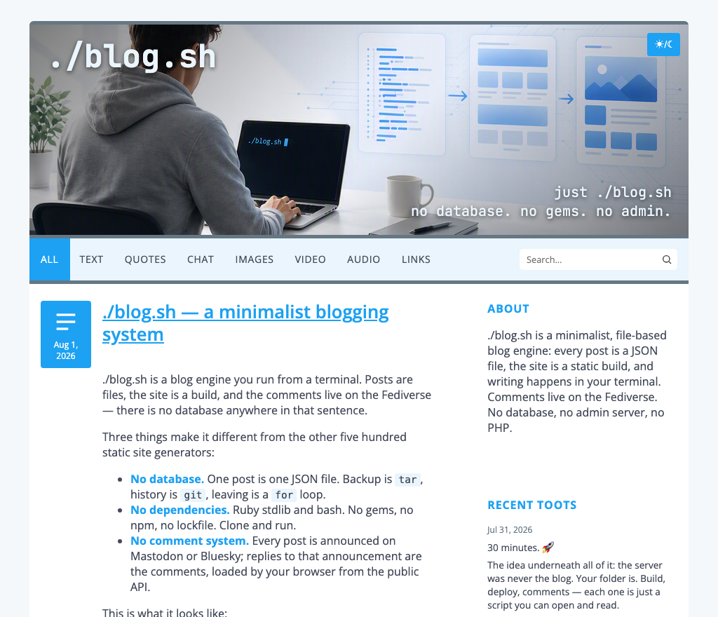
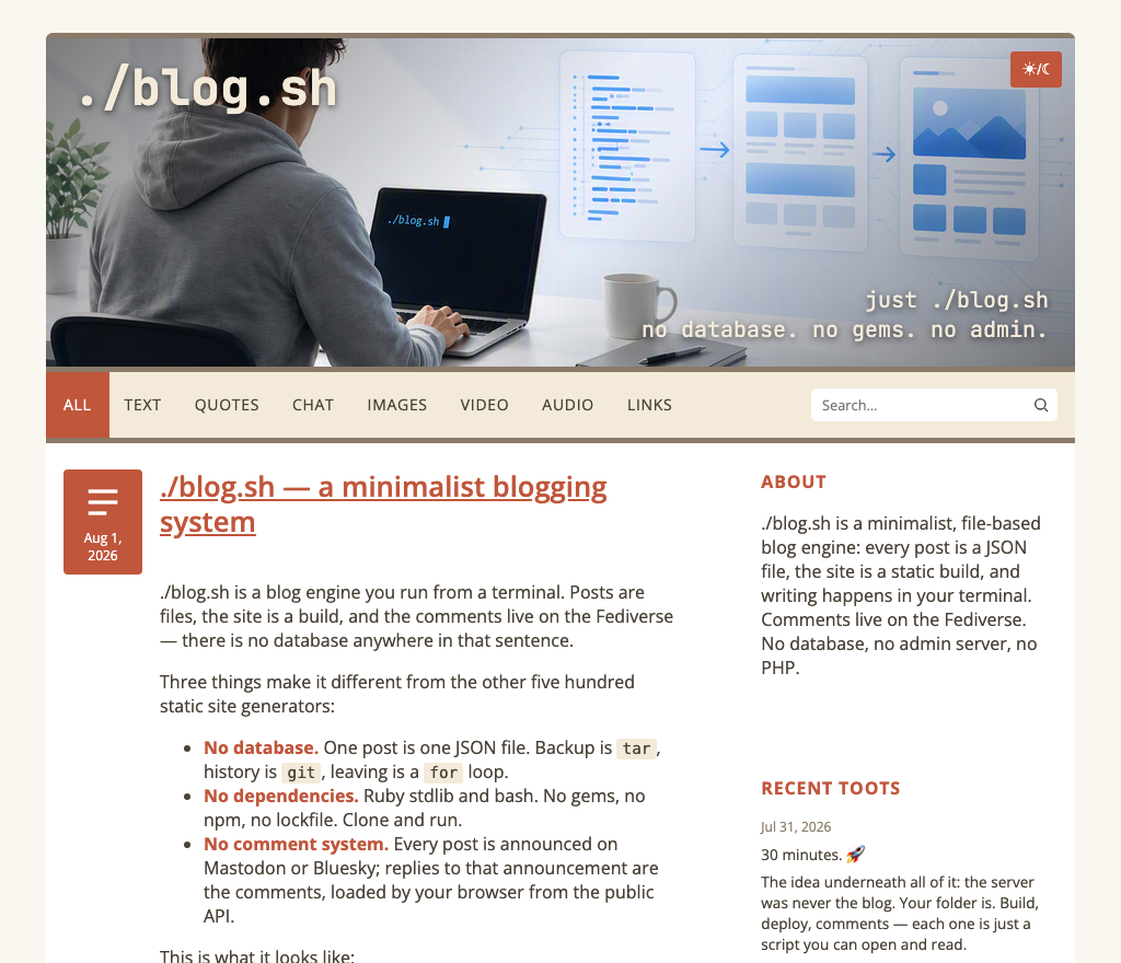
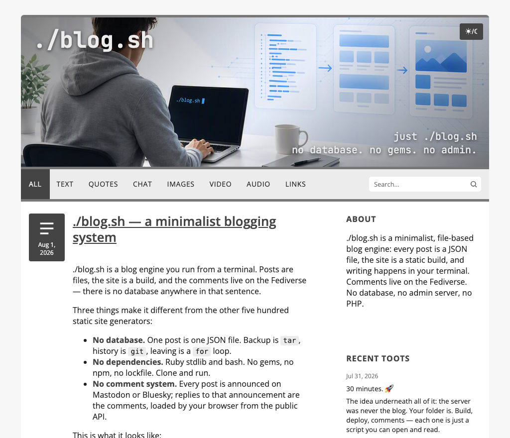
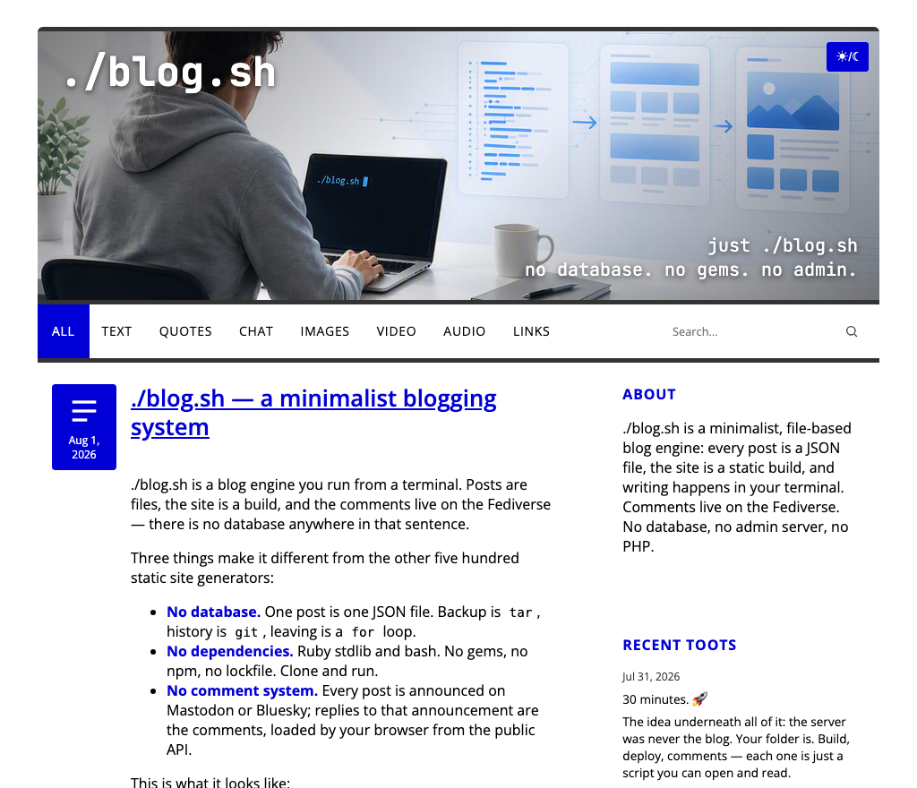
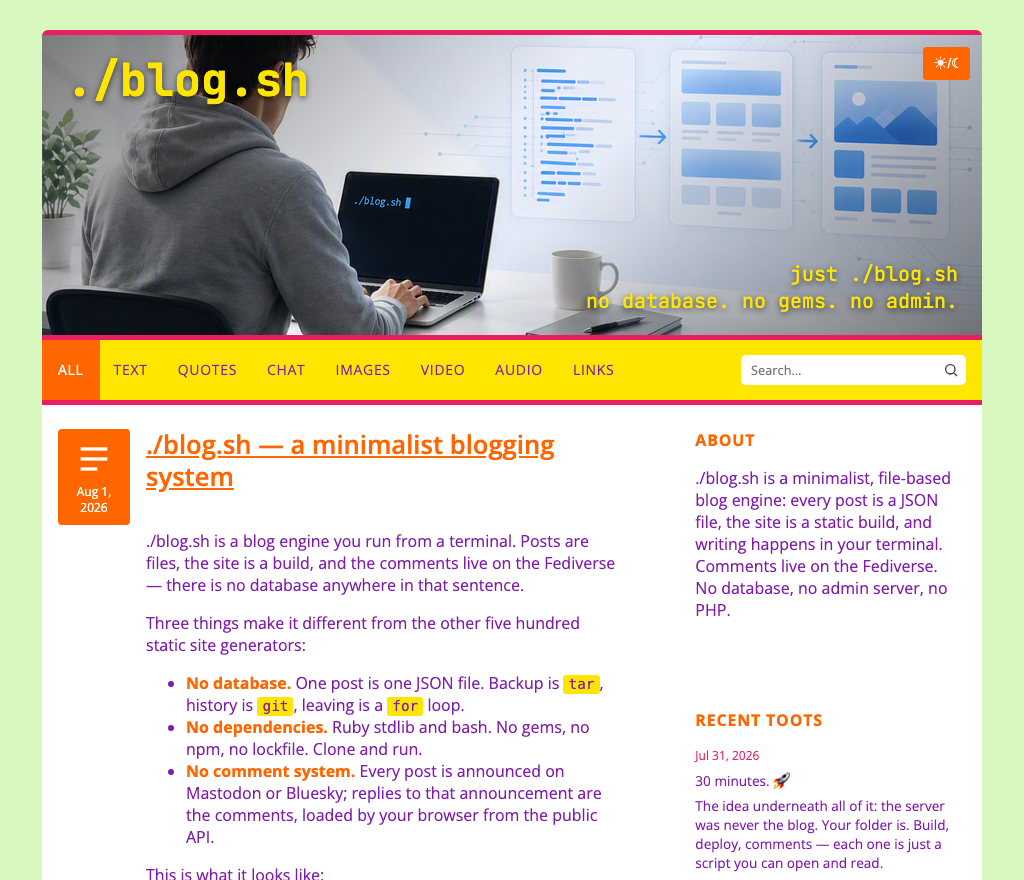
The hideous one is the proof, by the way: if the config can make it that ugly, the config really is in charge.
What you don't configure
Everything else is derived: card backgrounds, link hover states, the search field, code block backgrounds. Those aren't extra config keys, because in practice they never varied independently — every time I tried a palette, the derived values followed the base ones anyway. Seven keys per mode is the honest number of decisions involved.
Dark mode is the same seven keys again, so light and dark are two palettes, not one palette and a filter.
Two exceptions, on purpose
The banner can optionally override its title and claim colours — banner_title and banner_claim — because a banner is an image, and text sitting on an image plays by different rules than text on a flat background.
And one small thing I like too much not to mention: the scrim that keeps banner text readable only darkens the corner the text actually sits in. Turn the overlays off and your banner stays exactly as you drew it, corner to corner.
Comments