Minimal Literal: one column and a serif
./blog.sh v1.11 — part 7 of 12
Minimal is built for short things: a listing, three lines of an opening, a sidebar where something is always going on. It will carry a longer text, but the text is read the way a newspaper is, among everything else. Minimal Literal is the variant for blogs where the text is the point and the pieces are long. In it, the page is a book's setting.
This text is a guide, not a story: what is how and why, with the numbers read out of the file. Whatever is not here is the same as in Minimal and is in its guide. Every picture here is of this site in the engine's default palette. If you would rather not read all of it, there are ten questions at the end.
One sentence
Minimal Literal is a page set like a book: one column in the middle, a serif at a size that can be read for a long time, and nothing around the text that talks into it. It is a skin for blogs on ./blog.sh, of the Minimal family, and it takes its colours from the blog it runs on. From blog.sh 1.11 it comes with the engine: site.skin: minimal-literal in config/site.yml puts it on, as does ./style.sh under Layout, and ./blog.sh rebuild then applies it.
Principles
Five sentences in which it differs from Minimal. Minimal's own five still hold.
- The text has the page to itself. One column; what stood beside it stands under it.
- What is read speaks in a serif. What the engine says speaks as it does in Minimal.
- A line holds about seventy-five characters. The size of the type follows the column, not the other way round.
- A listing is read by its titles. The date is a fact under the excerpt, not an axis down the margin.
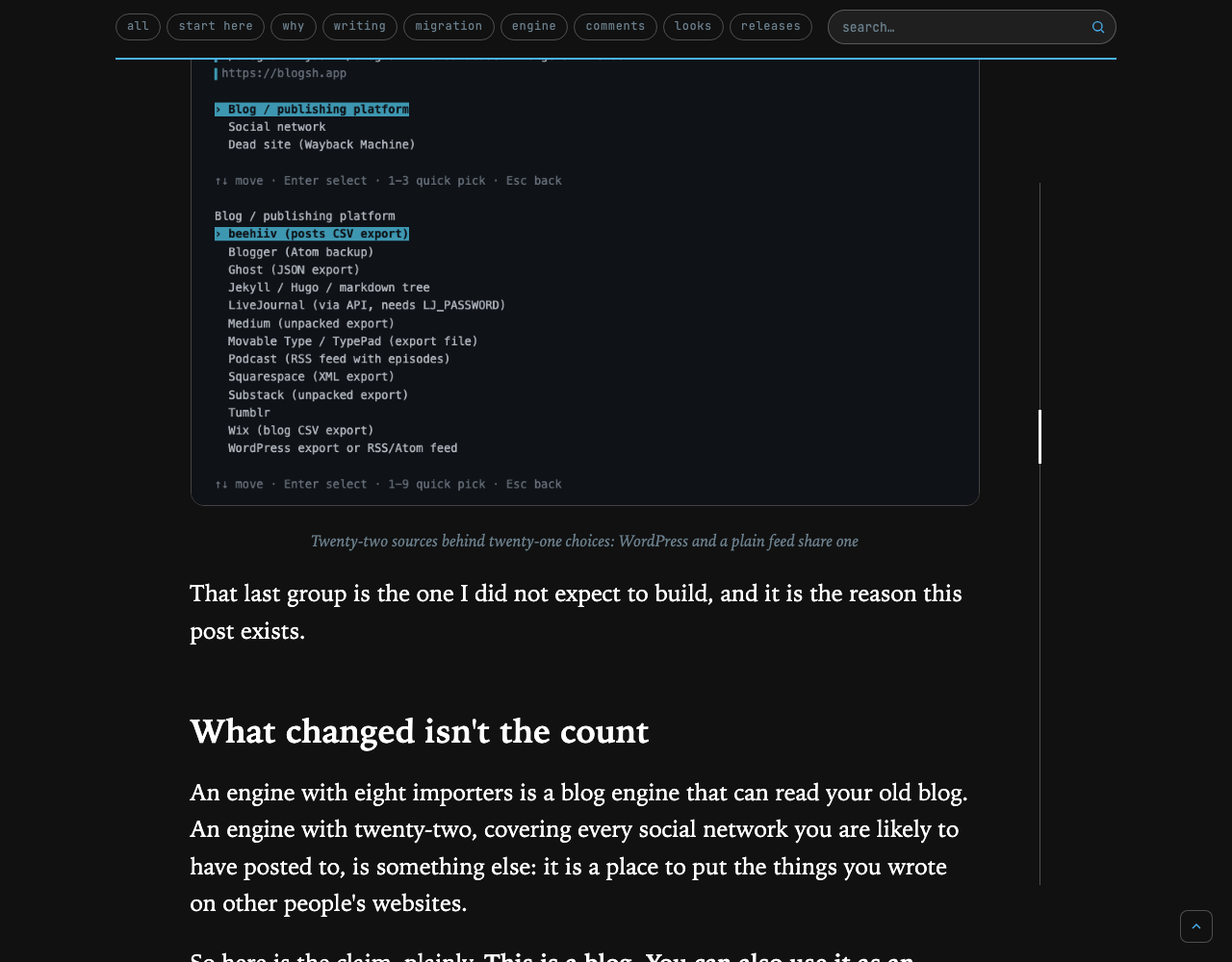
- The reader knows where in the text they are. In a long text a line on the right says so, and never by colour.
Colours
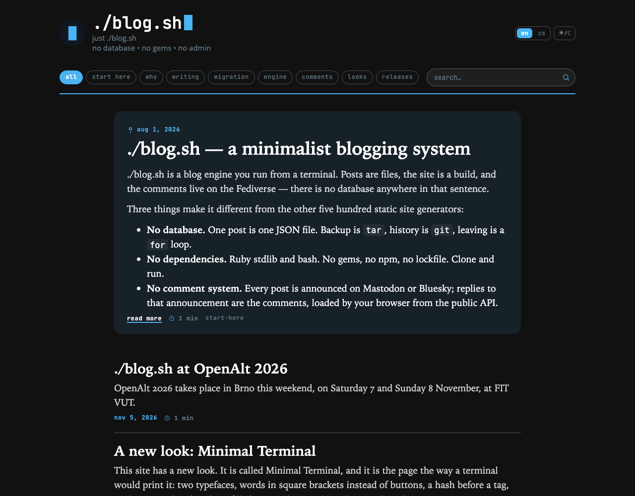
Unchanged. Paper, ink, muted and the accent are read from the blog's colors:; the rule, the plate and the lead's ground are mixed from them in the same proportions as in Minimal.
One thing changed colour: headings inside a text are in the ink, not in the accent. In a serif, at a book's size, a blue heading would be the loudest thing on the page, and the accent should stay what it is everywhere in the family: an action or a value the engine knows.
Type
Minimal's three voices stay; the middle one has another face.
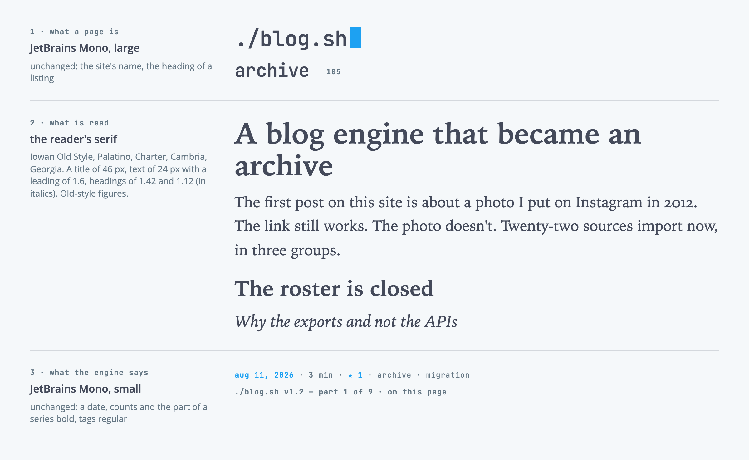
A serif carries everything that is read: a post's title, its text, the excerpt in a listing. The skin brings none and takes the one the reader's system has, in this order: Iowan Old Style, Palatino, Charter, Cambria, Georgia. So a Mac and an iPhone give Iowan, Windows gives Palatino or Cambria. The skin stays one file and nothing is downloaded.
A post's text is 24 px with a leading of 1.6. On a narrower screen it comes down with the column, to 19.5 px on a phone, so the line keeps its length: about 75 characters on a computer and a tablet, about 39 on a phone. Figures are old-style, so that a year in the middle of a sentence does not stand over the text like capitals, and long words are broken at the end of a line.
A post's title is a chapter's heading: 29 to 46 px by the width of the window, weight 600, not tightened. A heading of the second level is 1.42 of the text's size; of the third, 1.12 and in italics.
JetBrains Mono keeps both its voices unchanged: the site's name and a listing's heading large, and small and bold the date, the counts, the tags and the part of a series. Open Sans stays in the cards under the text, in the comments and on the engine's pages, save a search result's title, which is in the serif.
Shapes and marks
The pill, the key, the card and the filled button are Minimal's. Literal adds four things that belong to a text and sets them the way a book does.
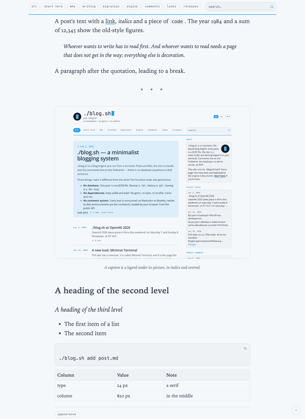
A quotation is a paragraph set in from both sides by 1.6 em, in italics, with no rule. It looks the same in a post, in a row of a listing and in the lead.
A break in the text is three stars in the middle of the column, in the muted tone, not a line.
A caption is a legend under its picture: in italics, centred, 0.72 of the text's size, in the serif.
The place line is an upright hairline to the right of the text with a mark in the ink, 3 px wide and 56 px tall. It has a paragraph of its own under Post.
Code keeps its own monospace on a plate and is a step smaller (0.82), so that it does not stand out beside the serif. A table is 0.78 of the text's size.
Rules and air
The column is 820 px wide and stands in the middle of the page. The head, the menu and the foot keep 1080 px as everywhere in the family, so the column is set in from them by 110 px on each side.
The column has two edges and both are rules. The upper one is the 2 px line under the menu; the lower one a hairline over the cards that in Minimal stood beside the text. The air at both is about the same: the content begins 33 px under the menu's line, and the way to the next page stands 28 px under a listing's last hairline and 28 px over the cards' line.
On a listing with no way to a next page, the last row gives up its hairline: the lower edge is the line over the cards, and two lines one over the other with nothing between them would not be an edge but a mistake.
The cards under the text stand three across on a computer, 28 px apart and 30 px under their line.
Front page and listing
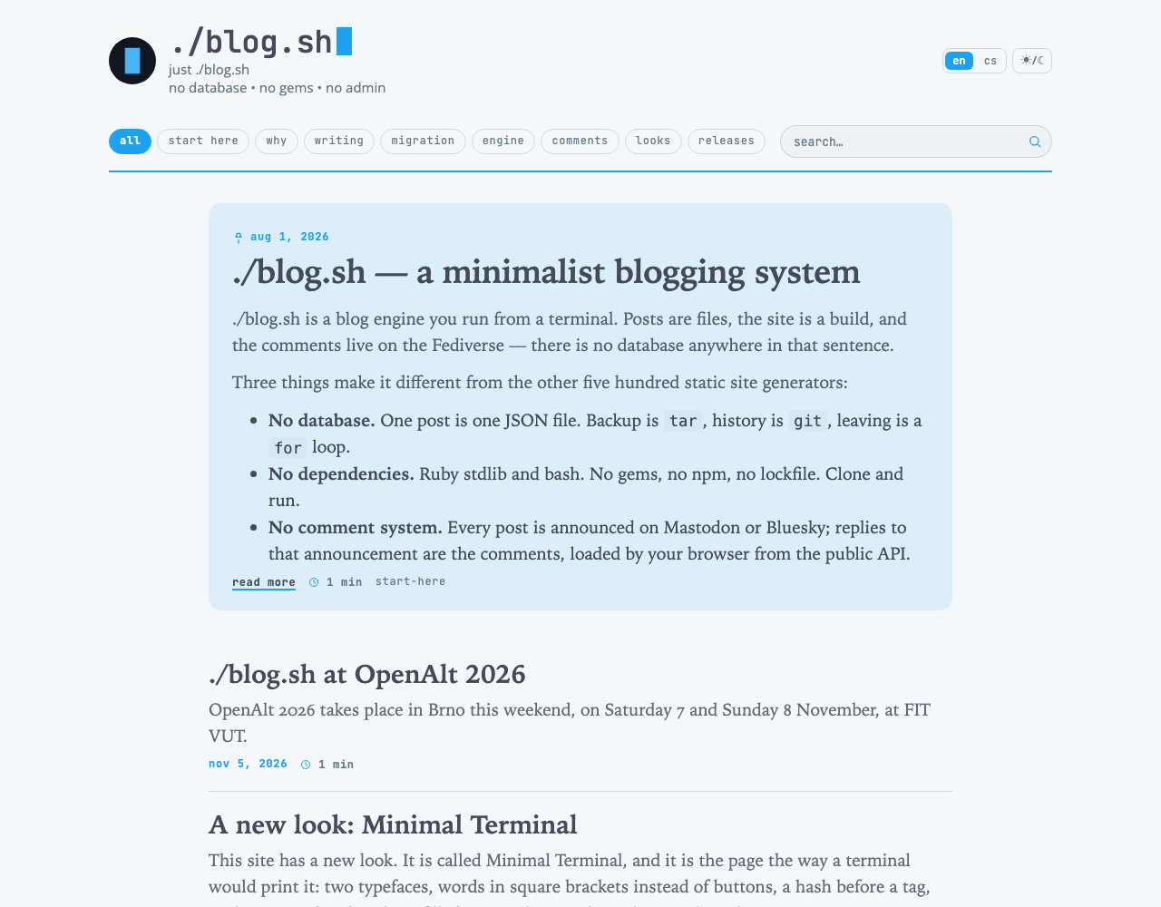
A row of a listing is read from the top down: the title (28 px), three lines of an excerpt (19 px) and one line of facts, in which the date comes first, before the reading time, the numbers from the network and the tags. Minimal's left column of dates is not here. There it is the axis a listing is walked along; a book's contents are walked by their titles, and the date is only one of the things the engine knows about a chapter.
The lead keeps Minimal's shape: the first post of the front page on a ground of the accent dissolved in the paper, the date over the title, a pin before the date. Only its setting differs: the text is in the serif, 19 px, and runs the width of the lead.
The post
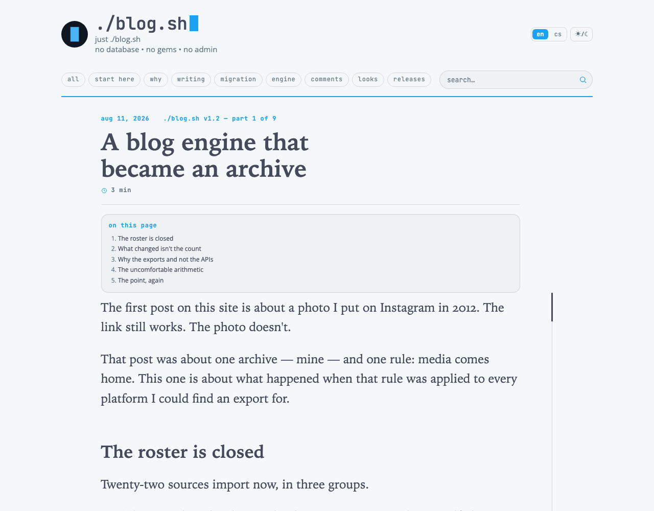
A post's page begins as in Minimal: the date in the accent and the part of a series, under them the title, a line with the reading time, and a hairline.
The contents ("on this page") are a block over the text, across the column. In Minimal they float to the right of the opening paragraph; at 24 px they would leave that paragraph half a line.
With a hero (layout.hero, or hero: on the post) the picture stands across the column and under it the title, in the same face and at the same size as any other. Without one, a post that opens with a picture has its title first, as any other.
The place line says how far into the text the reader is. A book says it by the thickness of the pages under each thumb; here it is a line to the right of the text and a mark that goes down it as the text goes from its first line to its last. It has four rules:
- It belongs to the text, not to the window. It begins where the first paragraph begins. Once the reader is in, it holds its place on the screen, from 190 px under the top to 8 % of the height over the foot, and the text moves past it. When the last lines have gone up the screen it goes out. It measures the text of the post alone, not the comments or the foot.
- Only a long text has one. A post of six paragraphs or more. A picture with a caption, or a note of three sentences, is seen whole and needs no telling where one is in it.
- It is in the ink. Where a reader is, is neither an action nor a value the engine knows.
- It is not on a phone. There is no margin beside the text there for it to stand in. On a tablet it stands in the page's margin by the right edge; from 960 px of width it stands 60 px from the text, and the text and the line are centred as one, so the column is about 32 px further left than on a listing.
There is no script. The browser itself ties the mark to the scroll, and where a browser cannot, nothing is drawn.
The engine's pages
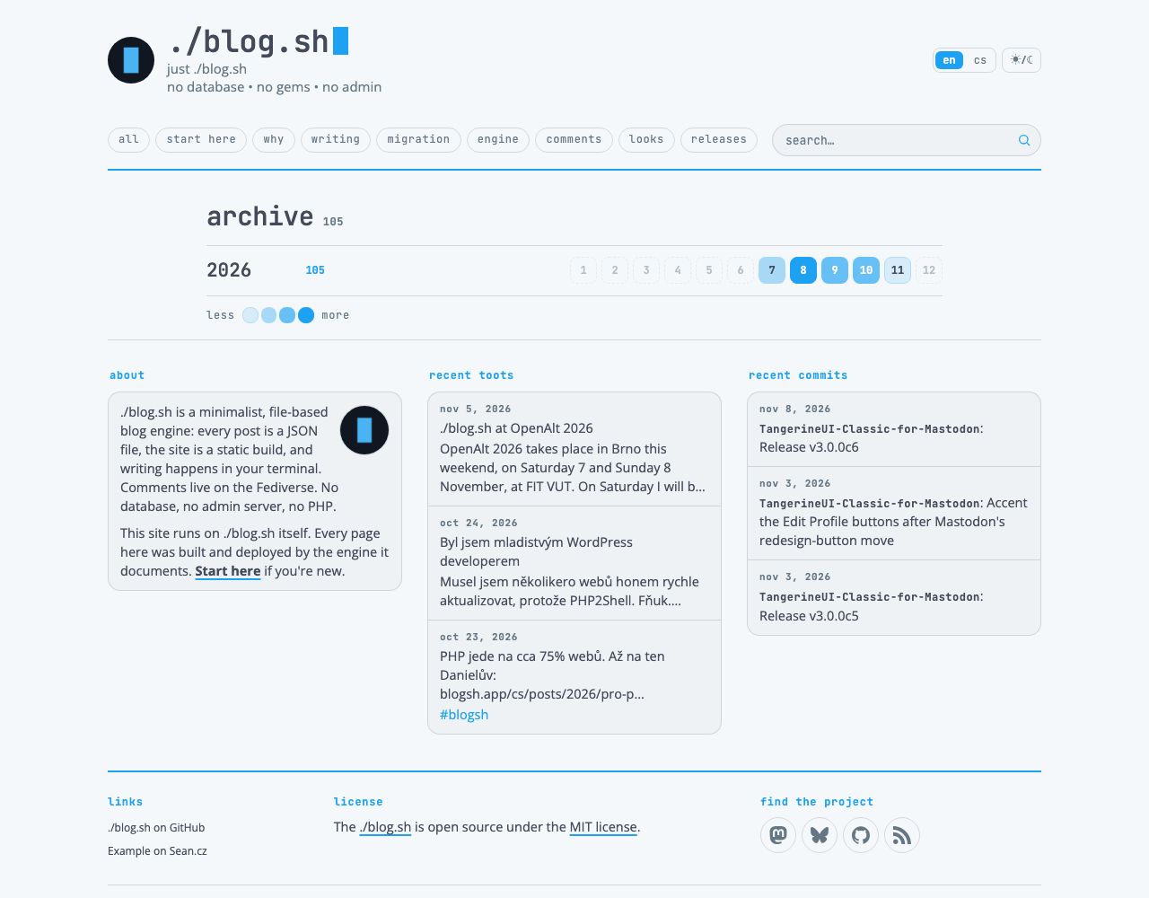
The archive, the tags, search and the page that is not there look as they do in Minimal, except that a search result's title is in the serif; a series is a listing like any other. All stand in the same 820 px column as a text.
State and response
Hovering, focus, the blinking cursor, pictures dimmed by night and noughts that are not shown are Minimal's. The place line answers to nothing and cannot be pressed; it is a fact, not a control.
A word longer than a line, a bare address as a rule, is broken. On a phone it would otherwise push the page out sideways.
Phone
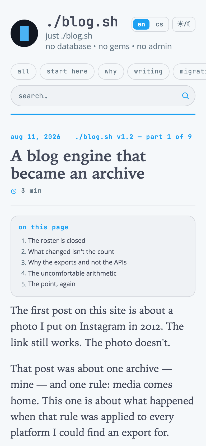
The column is the width of the screen less margins of 20 px. The text is 19.5 px with a leading of 1.55, a post's title 29 px, a title in a listing 24 px and an excerpt 18 px. A quotation is set in by one em instead of 1.6. The cards under the text go one under another.
There is no place line on a phone. The menu, the site's name and the lead behave as in Minimal.
The family
Minimal Literal is one of the Minimal family of skins for ./blog.sh, which stands on Minimal, Terminal on classic. The skins share four things: they read their colours from the blog's settings, they are one file, they touch no template, and their guides have these sections in this order (Manual adds one of its own). What Minimal can already do, a variant inherits unchanged; the table says what this one does otherwise.
| Minimal | Minimal Literal | |
|---|---|---|
| The page | a text and a column of cards beside it | one column of 820 px, the cards under the text |
| The face of the content | Open Sans | a serif, from the reader's system |
| A post's text | 17.5 px | 24 px, about 75 characters to a line |
| Headings in a text | in the accent | in the ink |
| The date in a listing | in the left column | the first fact under the excerpt |
| The contents | float beside the text | a block over the text |
| A quotation | a rule in the accent on the left | set in, in italics, no rule |
| A break | a hairline | three stars |
| Place in the text | none | a line with a mark, on the right |
Checklist
Ten questions before anything is added to the skin. If any of them comes out no, it is not Minimal Literal.
- Does the text stand in one column, with nothing beside it that does not belong to it?
- Is everything that is read in the serif, and everything the engine says in the monospace?
- Does a line of text hold about 75 characters on a computer and on a tablet?
- Are titles, headings and text in the ink?
- Is the date in a listing under the excerpt, and nowhere in a margin?
- Is a quotation set in, in italics and without a rule, wherever it appears?
- Is the air under the menu's line about the same as around the way to the next page, and are there nowhere two lines one over the other?
- Does only a long text have the place line, is it in the ink, and does it begin where the text begins?
- Is the page whole and readable where a browser cannot draw the place line, and on a phone without it?
- Does the skin carry only itself: no font, no script, no touching a template?
Changes
13 October 2026: the first edition.
14 October 2026: one name for each thing across the family's guides; links to Minimal's guide and to the family.
16 October 2026: the skin comes with the engine from blog.sh 1.11, put on with site.skin: minimal-literal.
12 November 2026: brought up to date with blog.sh 1.11. The air around the way to the next page as measured, 28 px; the last row's hairline only on a listing with no next page; a picture over the title only with a hero; a search result's title in the serif. New pictures of this site.
Comments