Minimal: paper, ink and one colour
./blog.sh v1.11 — part 5 of 12
Minimal began as a coat for one site, sean.cz, and was meant to stay there. Then a family grew out of it: Minimal Terminal, Pictorial, Literal, Journal and Manual. Variants of something nobody can have make little sense. So Minimal is now the base of the family, and a skin any blog on ./blog.sh can wear.
Sean.cz keeps an edition of its own, with three typefaces, a cream paper and its orange; that one has its own manual. This guide describes Minimal as everybody gets it: the two faces the engine ships, and the colours of the blog it runs on. Every picture here is of this site in the engine's default palette. If you would rather not read all of it, there are ten questions at the end.
One sentence
Minimal is a page of paper and ink with one colour, which belongs only to what can be pressed and to what the engine knows. It is a single stylesheet over ./blog.sh, with no other file beside it, and the base four of the five other skins of the family stand on. Each of them has a guide of its own, with the same sections in the same order (Manual adds one of its own). From blog.sh 1.11 Minimal comes with the engine: site.skin: minimal in config/site.yml puts it on, as does ./style.sh under Layout, and ./blog.sh rebuild then applies it.
Principles
Five sentences from which everything else follows.
- The accent is an action or a value the engine knows. Nothing else is coloured.
- Three voices, two faces. A page's name, the content and the engine's voice; none stands in for another.
- No shadows. An edge is drawn by a hairline, and where even that is not needed, by air.
- A listing is rows, not cards. A card is only for what holds more than one line, and for the lead.
- The colours are the blog's. The skin reads them from its settings and carries none of its own.
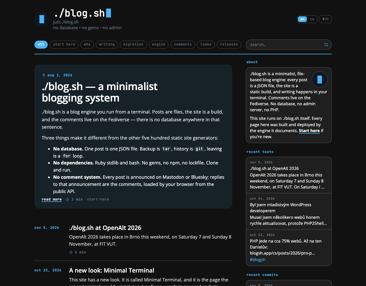
The first matters most, and it fits in one sentence: the accent means an action or a value the engine knows. In the accent is what can be pressed, what is selected right now, and what ./blog.sh knows about a post by itself: a date, a count in the archive or the tags, the icons beside the numbers. Beyond that the accent draws only the page's frame: subheadings, the two rules, the cursor and the ground of the lead. Titles and text are always in ink, because they are content, and content should not compete with the controls. The icons of social networks in the foot are grey until you point at them. When something in the accent appears on a page and is neither an action nor a value, it is a mistake.
Colours
The whole language rests on four tones and one colour. The tones are called paper, ink, muted and rule; a fifth, plate, is only ink dissolved so thin that barely a shade is left. The colour is one, the accent.
The skin holds none of them itself. It reads paper, ink, muted and accent from colors: in the blog's settings, for the day and for the night. The rest it mixes out of those:
- the rule is ink at 18 % by day and 26 % by night,
- the plate is ink at 3 % by day and 6 % by night,
- the ground of the lead is the accent laid over the paper, 12 parts in a hundred by day and 10 by night.
Recolour the blog and you have recoloured the skin, and the proportions hold. A blog that says nothing about its colours gets the engine's default palette:
| Day | Night | |
|---|---|---|
| Paper | #f5f8fa | #111111 |
| Ink | #444a5a | #ffffff |
| Muted | #657784 | #6a7f8c |
| Accent | #1da1f2 | #4ab3f4 |
| Rule (over paper) | #d5d9dd | #4f4f4f |
| Ground of the lead | #dbeef9 | #172128 |
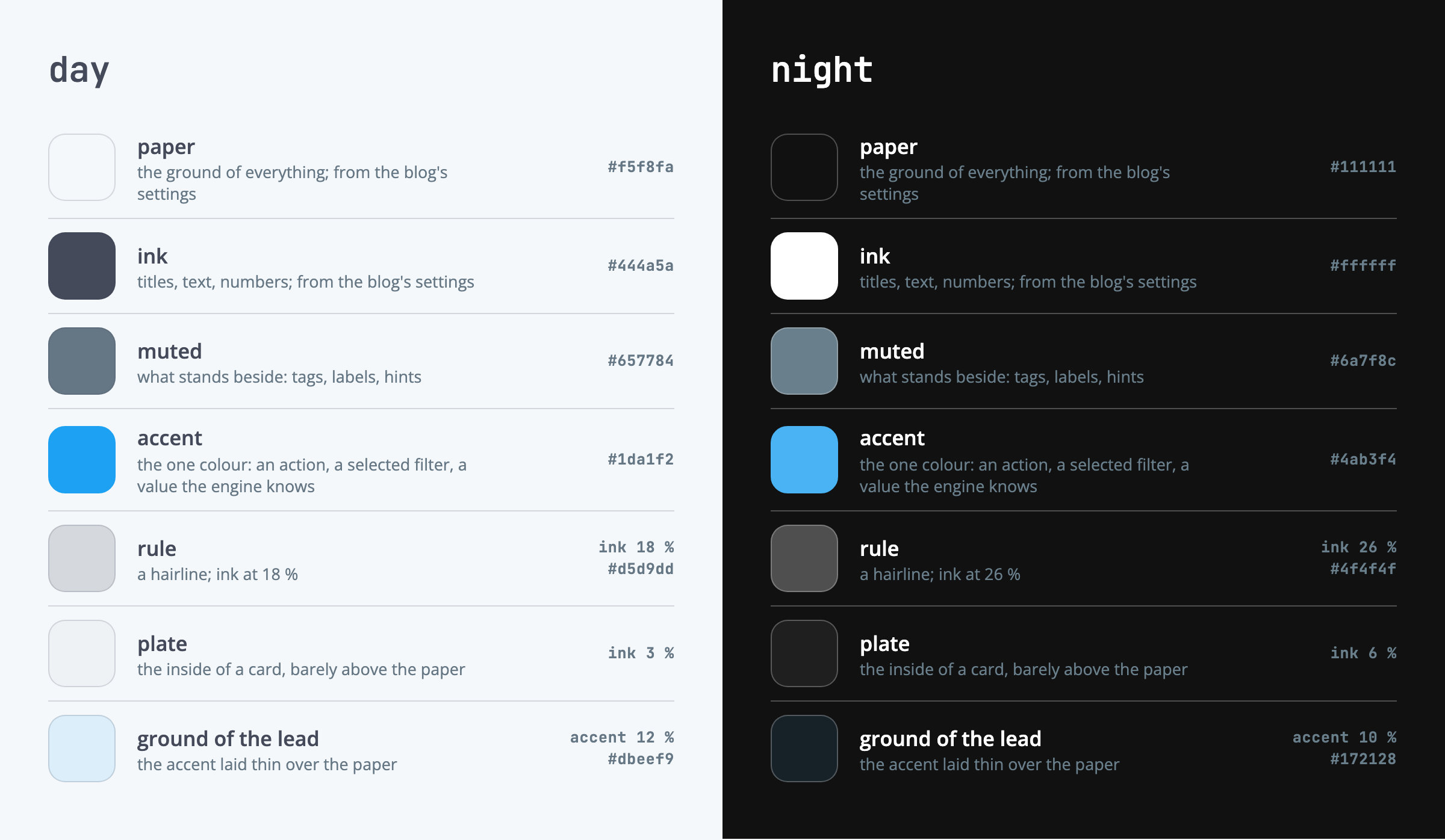
On the accent, type is always white. That and the black behind a video are the only colours the skin writes as a number.
Type
Two faces and three voices. The engine ships both faces, so the skin is one file and nothing extra is downloaded. Code is the one exception: it stands in the system's own monospace.
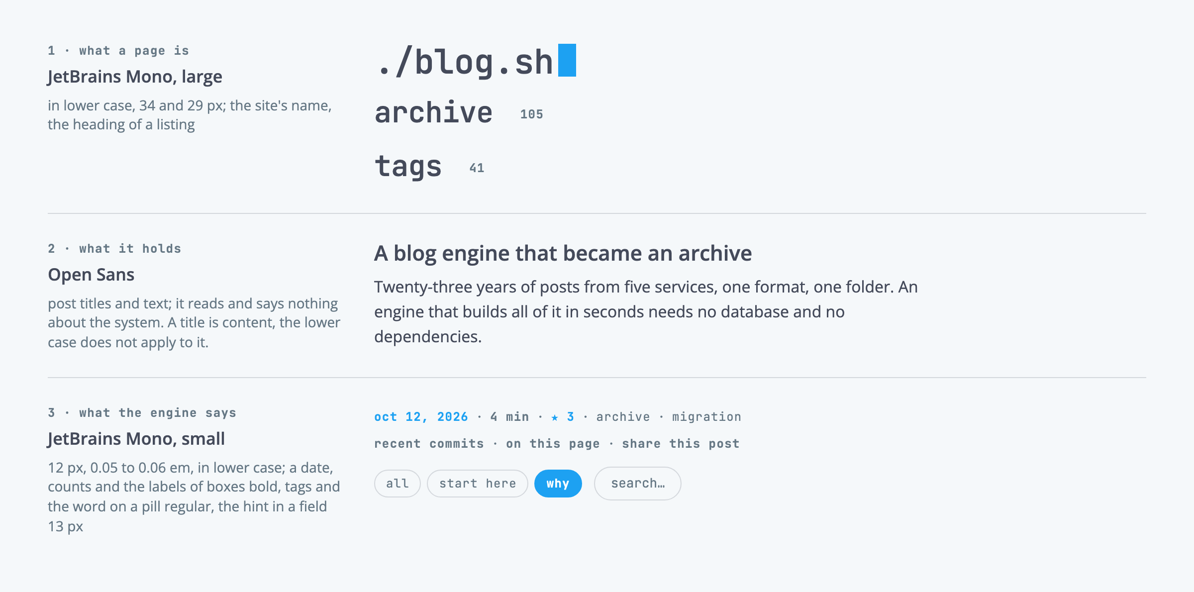
JetBrains Mono, large and in lower case, says what a page is: the site's name in the head (34 px), the heading of a listing (29 px). It is set in lower case with slightly negative tracking (−0.01 em), so that a monospace does not sit too wide on the page.
Open Sans carries the content: post titles (weight 600, in ink) and text: 16 px with a line height of 1.55 in a listing, 17.5 px and 1.68 in a post, 16 px and 1.62 on a phone. It is a face that says nothing about the system, so it should say only what was written. A title is content; the lower case does not apply to it.
JetBrains Mono, small and bold, is the engine's voice: 12 px, with a little air between the letters (0.05 to 0.06 em), in lower case. A date, counts and the labels of boxes are bold; tags and the word on a pill are regular; the hint in a field is 13 px. What ./blog.sh writes, the author did not, and that should be plain at a glance, without reading.
The first voice and the third speak in the same face and differ in size, weight and place. The sean.cz edition has a face of its own for each voice; the rule is the same, only three faces hold it there instead of two.
Links in the text are in ink and underlined in the accent, 1.5 px with an offset of 3 px; under the pointer the underline thickens to 2.5 px and the colour of the text stays. Coloured text in a paragraph would be either a link or a mistake, and that ambiguity is not worth coloured words.
Shapes and marks
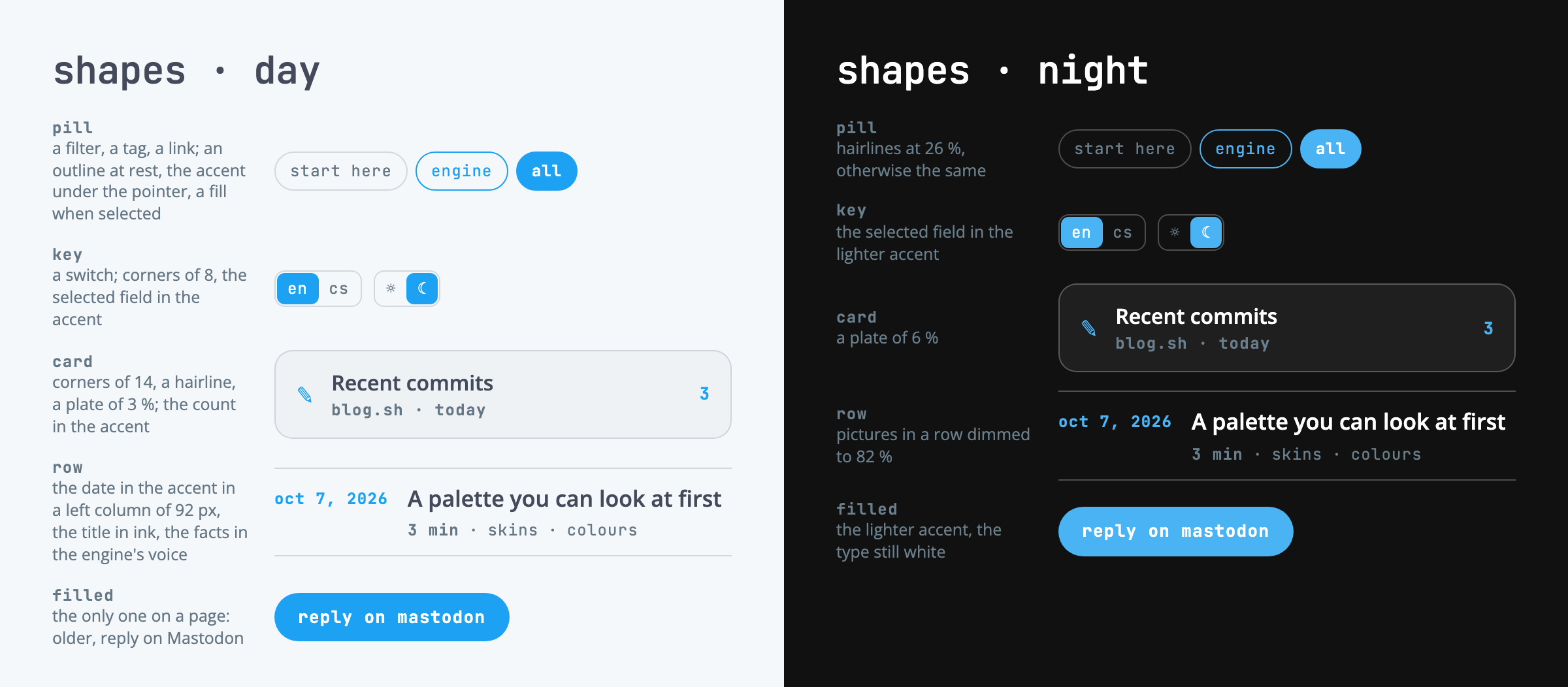
A pill (radius 999) is a filter, a tag or a link: at rest an outline in the hairline with muted type, under the pointer outline and text in the accent, selected it is filled with the accent and lettered in white. Tags in a listing have no pill; they are only muted words after the reading time. They get a pill on the post's own page, where they can be pressed.
A key (corners of 8, inner fields 6) is a switch: language, light and dark. The selected field is filled with the accent. The pill is kept for filters and links, so that it is plain at a glance what filters the content and what switches the page.
A card has corners of 14, a hairline and a plate. It is used wherever there is more than one line inside: the boxes in the sidebar, an article's contents. A post in a listing has no card: it is an open row, the date in a column on the left, the title beside it, an opening of three lines under that, and one line of facts. Only a hairline separates the rows.
The filled button is the only one on a page: "older" on a listing, "reply on Mastodon" under a post. When you see a fill in the accent, it is the one thing this page wants you to do. Sharing to Mastodon is therefore an outline again, even though it stands a line higher.
The mark in the head is the blog's favicon in a circle of 52 px, with no outline, and after the site's name a cursor blinks in the accent.
Rules and air
Minimal has no shadows. The edge of a thing is drawn by a hairline, 1 px in the rule's colour, and where even that is not needed, by air alone. Two exceptions are drawn in the accent and are 2 px thick: the line under the menu and the line over the foot. They frame the page from above and below, and they are the only two horizontal lines in the accent that are not an underline.
The page gutter is 20 px. The page is at most 1080 px wide including the gutters, the sidebar 300 px, 240 between 861 and 1000 px of width. Up to 860 px of width, where the sidebar folds under the content, text runs to the same right edge as pictures.
The rows of a listing stand 41 px apart with a hairline between them. Under the lead there is more air, 54 px to the next post's date (48 on a phone), and no rule: the listing begins below it, and the lead is not its first row.
Front page and listing
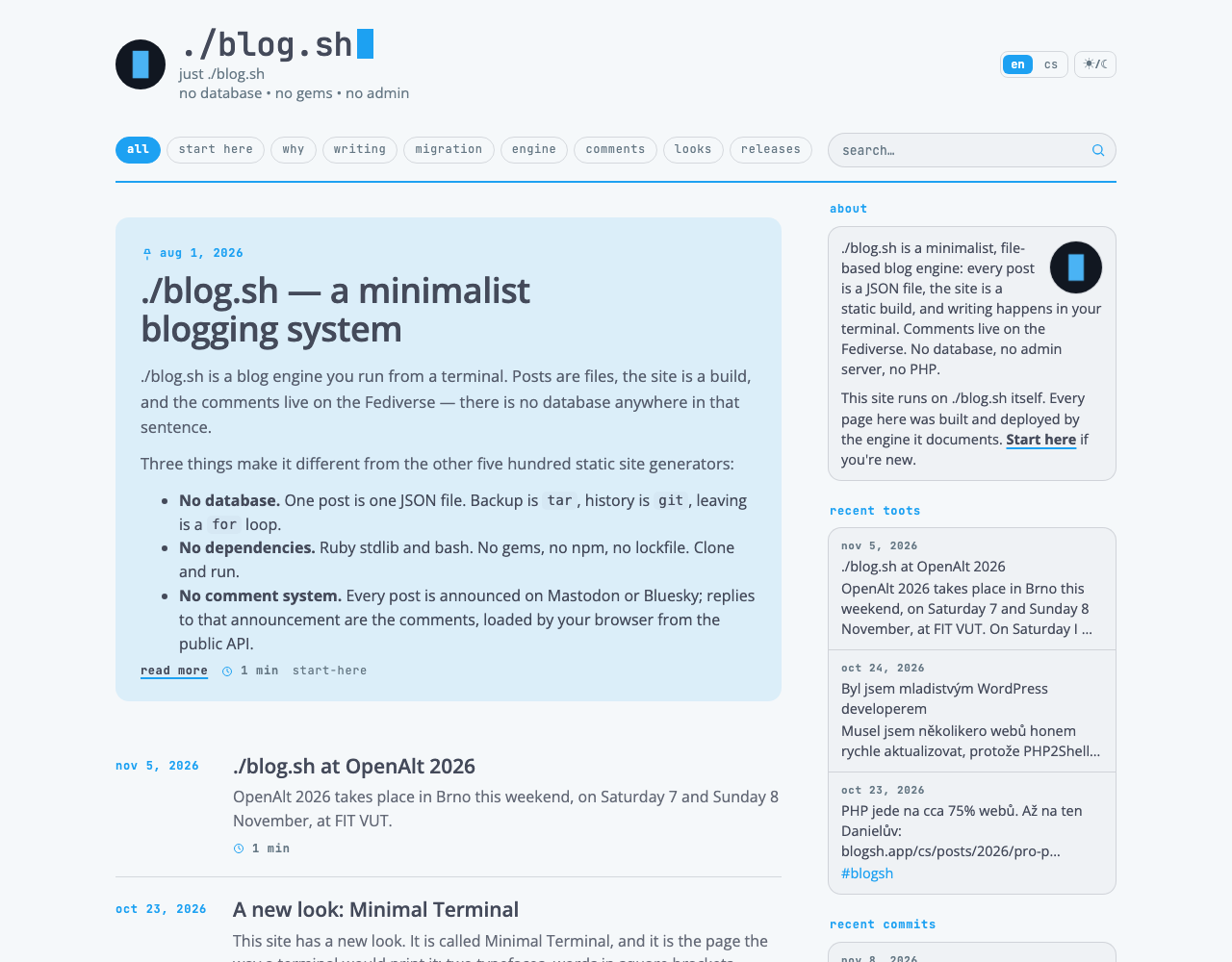
The front page is a listing of open rows: the date on the left, the title, an opening of three lines and a line of facts. The first of them is different.
The lead is the one exception. The first post on the front page (the pinned one, where there is one) stands on a ground of its own, only it is not a plate: it is the accent laid thin over the paper, with corners of 14 and no hairline, because the tone itself is the edge. The date moves from the left column to above the title, the title grows from 21 to up to 36 px (26 on a phone), and the opening runs to five lines instead of three. The ground is not a second colour; it is the paper a step nearer the accent, and on a blog with another accent it recolours itself.
The lead is told by its place, not by what it holds: it is the first post on the front page, with a picture or without. With layout.lead_card: true in the settings its first picture opens the card and spans the full width. Without one it has room and takes it: it shows the whole of what the engine let into the card (or the teaser, if the post has one), in full paragraphs, with a "read more" link in the line of facts. A pinned lead says so with a pin before its date, which also answers why a post months old is the first thing on the page. All of this holds on the front page only; on the second page of the listing the first post is an ordinary row again.
The post
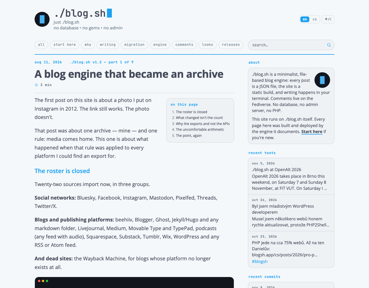
A post's page opens with the date in the accent. Under it stand the title in Open Sans (weight 700, 27 to 36 px by the width of the window, 25 to 30 on a phone) and a line with the reading time and the numbers from the network. Subheadings are in the accent, the title and the text in ink. A longer post gets a box with the article's contents, a card on a plate; it appears by itself from four headings up. Code stands on a plate with a hairline; a quotation is held by a 2 px rule in the accent on its left. Under the text come the way to the neighbouring parts of a series and the tags, then sharing, and under a hairline the comments. The one filled button on the page is "reply on Mastodon".
The engine's pages
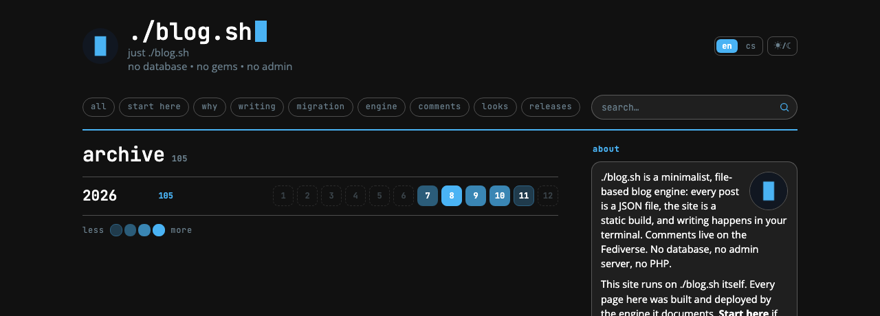
The archive is a row per year: the year, its count and twelve months as keys. An empty month has only a dashed outline. A month with posts is filled with the accent laid over the paper, in four steps by the number of posts: 14, 36 and 66 parts in a hundred by day, 26, 46 and 72 by night, and finally the accent whole. Tags are pills in alphabetical order. Those with ten posts or more stand on the accent at 12 % by day and 26 % by night, those with a hundred or more at 42 % and 62 %, and a tag used once is a small word with no frame and no count. Search returns the same rows as a listing, with the date on the left.
State and response
The response is hovering: a control gets its frame and its text in the accent under the pointer, a title or a link in a row keeps its ink and gets an underline in the accent; filled things keep their fill and only fade a little. Focus from the keyboard is an outline in the accent.
The cursor after the site's name blinks like a terminal's, 1.1 s, a sharp switch with no fading. If your system asks for reduced motion, it stands still.
At night pictures, videos and thumbnails from other networks are dimmed to 82 % brightness, so that a white screenshot does not stand on a dark page like a lamp. Under the pointer they return to full brightness, and an enlarged picture is never dimmed; by then you are looking at it, not at the page.
A number that is zero is not shown. A post with no stars and no comments has no numbers in its line of facts, only the reading time and the tags.
Phone
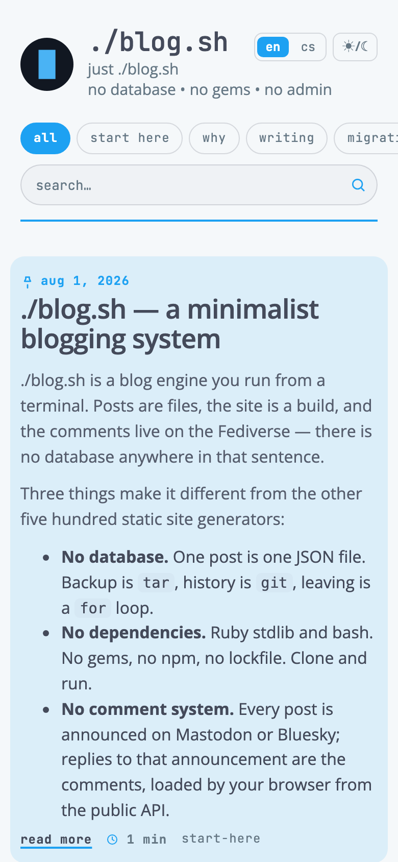
Up to 700 px wide nothing is redrawn, only stacked; from 560 px the date leaves the left column and goes above the title, and the sidebar, which already folds under the content from 860 px, stays below. Three things have a rule of their own.
The menu is one row of pills that slides sideways and runs off the right edge to show that there is more of it. Two rows of pills would stand between the reader and the first post.
The site's name gives way to the language and appearance switches. A stylesheet cannot see two things overlap, but it can work out the room: the width of the screen less the mark, the switches and the air between them, and a monospace is six tenths of its size to a character. So the name is as large as that room allows, 34 px at most and 19 at least. All this holds with a language switch; on a site with one language the name simply drops to 25 px at 360 px. The base reckons with a name of nine characters, which is "./blog.sh"; a blog with a longer or shorter name says its number in a stylesheet of its own, with one variable.
The lead reaches ten pixels into the page gutter on each side, so the text inside it stands on the same edge as the rest of the listing.
The family
Minimal is the base of a family of skins over ./blog.sh. They all share four things: they read their colours from the blog's settings, they are a single file, they touch no template, and their guide has these sections in this order. What Minimal already does, a variant built on it inherits unchanged; it differs only in what makes it different. Terminal alone is written over classic.
| How it differs from Minimal | |
|---|---|
| Minimal, the sean.cz edition | three typefaces of its own instead of two; nothing else |
| Minimal Terminal | a page the way a terminal would print it: brackets for buttons, marks for shapes |
| Minimal Pictorial | a listing is a wall of photographs, and a post opens with its picture |
| Minimal Literal | a page set like a book: one column in the middle, a serif, about seventy-five characters to a line |
| Minimal Journal | a diary: a line of time down the listing, the date leads and an entry is read whole |
| Minimal Manual | a handbook: chapters on the left, numbered sections, the contents on the right |
| Minimal Mobile (its guide comes with the apps) | the same language in the phone apps, translated from pointing to touch |
Minimal Mobile is the one exception: it is the same language in the apps, not a skin, so the four things above do not apply to it.
Checklist
Ten questions before anything is added to the skin. If the answer to any of them is no, it is not Minimal.
- Is the only thing in the accent what can be pressed, what is selected, or what the engine knows?
- Are post titles and text in ink?
- Is there at most one filled button on the page?
- Does each of the three voices speak only for itself: a page's name in the large monospace in lower case, the content in the sans as it was written, and the engine in the small bold monospace?
- Do cards have corners of 14, keys 8 and pills round, and does nothing have a shadow?
- Are the rules hairlines, and only two of the horizontal ones in the accent?
- At night, are pictures dimmed, and do the rule and the plate keep their night proportions?
- Does only the first post on the front page stand on a ground of its own, and is that ground the accent laid thin over the paper, not a new colour?
- Does the skin carry only itself: no typeface, no picture, no hand on a template?
- Does the skin read its colours from the blog's settings, with none but the white on the accent and the black behind a video written as a number?
Changes
13 October 2026: the first edition of this guide. Minimal became the base of the family: it took the engine's faces and stopped carrying files of its own. The edition with three typefaces stayed on sean.cz.
14 October 2026: the family grew by Literal, Journal and Manual, and every guide of it is linked from the table under The family; one name for each thing across the family (the line of facts, a hairline).
16 October 2026: Minimal comes with the engine from blog.sh 1.11, and so does every variant of the family: site.skin: puts one on, and extra_css is no longer needed for it.
12 November 2026: brought up to date with blog.sh 1.11. Text sizes in a listing, a post and on a phone; the engine's voice and the system face for code; the frame the accent draws; the night steps of the archive and the tags; the lead's picture only with layout.lead_card; the order at the end of a post; hovering; the sidebar between 861 and 1000 px; the name on a phone with one language; Terminal stands on classic. New pictures of the front page, a post, the archive and a phone.
Comments