Minimal Terminal: two faces and square brackets
./blog.sh v1.11 — part 6 of 12
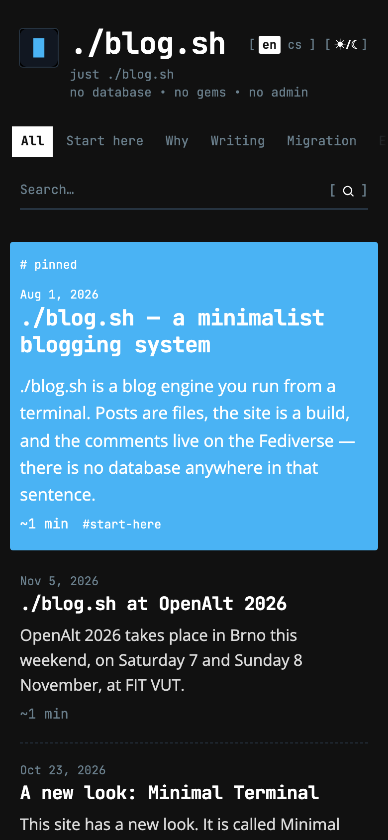
Minimal was made for a personal site, and it shows: a cream paper, pills, cards. When I tried it on a blog about an engine that is run from a terminal, it fitted, but it said nothing of what that site is. So Minimal Terminal came about: a variant that took Minimal's discipline and said everything else in its own way. A page in it looks the way a terminal would print it.
Decisions scattered through one stylesheet and my head are not enough, so this is a guide, not a story. What is how and why, with the numbers read out of the file, not rounded. If you would rather not read all of it, there are ten questions at the end.
One sentence
Minimal Terminal is a page the way a terminal would print it: two faces, brackets for buttons, marks for shapes, and a single fill, the inverse of a selection. It is a skin for blogs on ./blog.sh, the second of the Minimal family, and it takes its colours from the blog it runs on. From blog.sh 1.11 it comes with the engine: site.skin: minimal-terminal in config/site.yml puts it on, as does ./style.sh under Layout, and ./blog.sh rebuild then applies it. It sets the name and the claim as text, so banner.show_image: false suits it.
Principles
Four sentences hold the whole skin together.
- Two voices. The monospace says everything the engine says. The sans is what was written.
- No shapes. Nothing round, nothing filled, nothing in a frame. A thing is set apart by a rule, by its face, or by a mark from the terminal.
- The accent is for what can be acted on, and for the edge of a block of code. Dates, labels and icons are quiet.
- Rules between things are dashed; rules that hold the page are solid.
And a fifth, which only came out of the work: data is not drawn. No chart, no map, no little bars. What the engine knows, it says in text. Why, comes up at the archive.
Colours
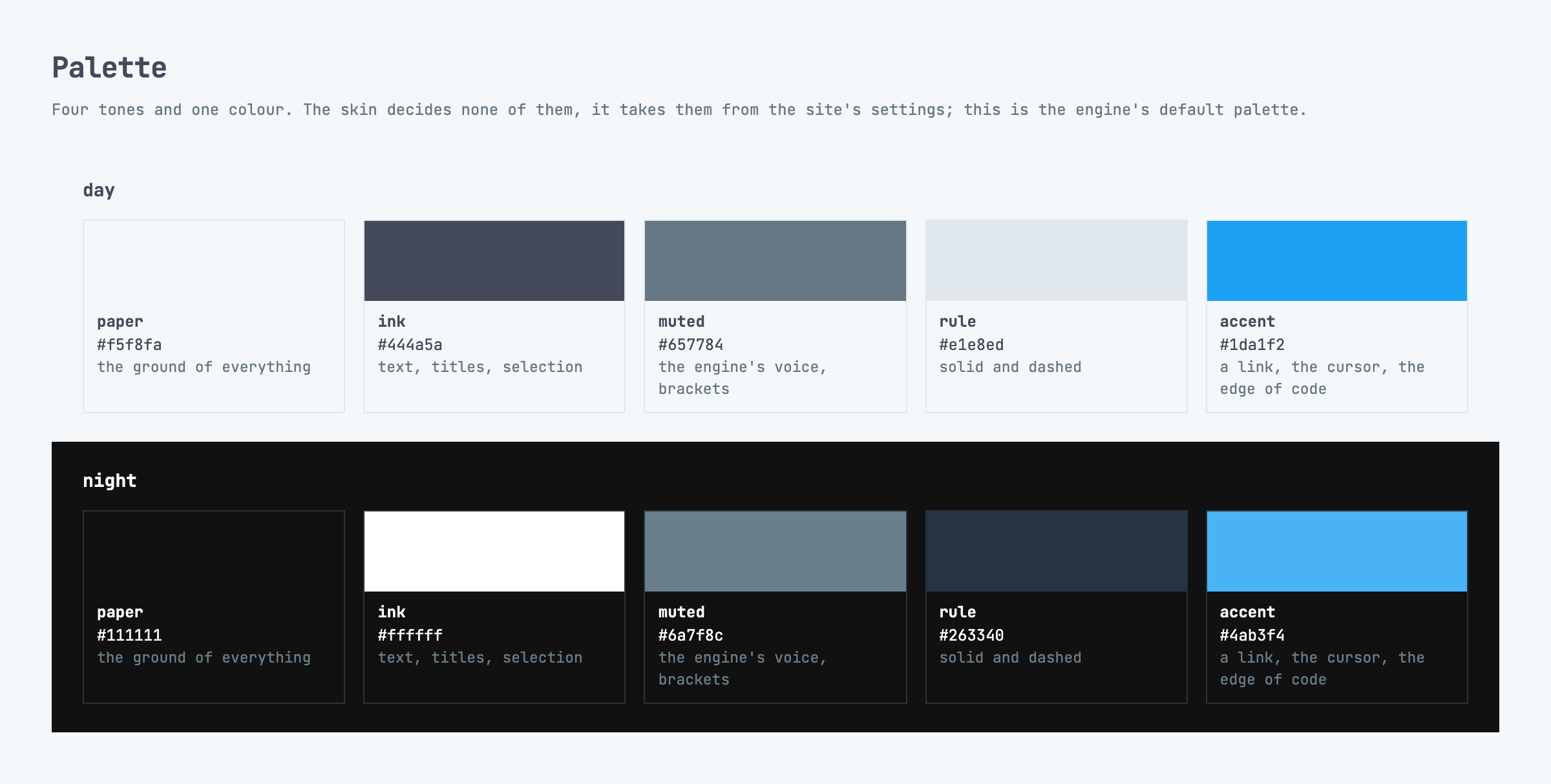
Minimal Terminal has no colour of its own, any more than Minimal has. The engine writes the site's colours from colors: in site.yml into variables, for the day and for the night; the skin reads five of them and only renames them its own way: paper, ink, muted, rule and accent. Recolour the site and you have recoloured the skin.
On this site they are the engine's default colours:
| Day | Night | |
|---|---|---|
| Paper | #f5f8fa | #111111 |
| Ink | #444a5a | #ffffff |
| Muted | #657784 | #6a7f8c |
| Rule | #e1e8ed | #263340 |
| Accent | #1da1f2 | #4ab3f4 |
A sixth tone, the plate, is not given but mixed: ink dissolved to 4 % by day and 7 % by night. It lies under a block of code and under a menu item the pointer is on. Nothing else is mixed, save the four steps of the archive, and those are made of the accent.
A card, the menu and the foot stand on the same paper as the page. No surface is lighter or darker than another, so the page is divided by rules, not by colour.
The accent
The rule says: the accent is for what can be acted on. An honest list is longer than one sentence, so here is all of it.
- A link in the text has the ink's colour and an underline in the accent, 1.5 px, offset by 3 px. The text stays readable; the colour only says "this can be clicked". Titles and the rows of the sidebar get the same underline only under the pointer.
- A mention
@someoneand a hashtag in a toot are in the accent whole, with no underline. - Focus from the keyboard is an outline in the accent.
- The cursor after the site's name, a block that blinks once in 1.1 s. For anyone whose system asks for reduced motion it does not blink.
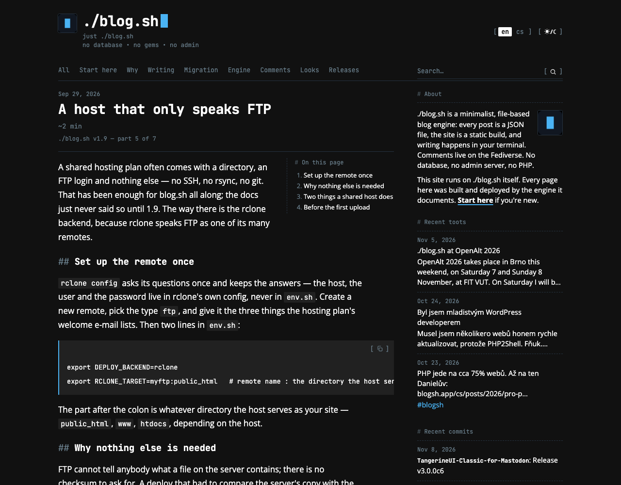
- The edge of code: a block of code is a plate with a 2 px rule in the accent on its left.
- The mark of a quotation,
>. - The pin of a pinned post.
- The steps of the archive and the outline of the author's avatar in the comments.
- The ground of the lead, the one large surface in the accent on the whole site.
- The controls in brackets under the pointer, and copying code at the moment it worked.
- The menu item of the chapter you are in, the line of a field in focus and the count of a tag with a hundred posts or more.
What the accent does not have: a date, counts other than that one, tags, labels, icons at rest. That is a difference from Minimal, where the accent carries what the engine knows as well. Here the muted tone carries that and the accent has less work to do; with a whole lead filled with it besides, that is the right measure.
Type
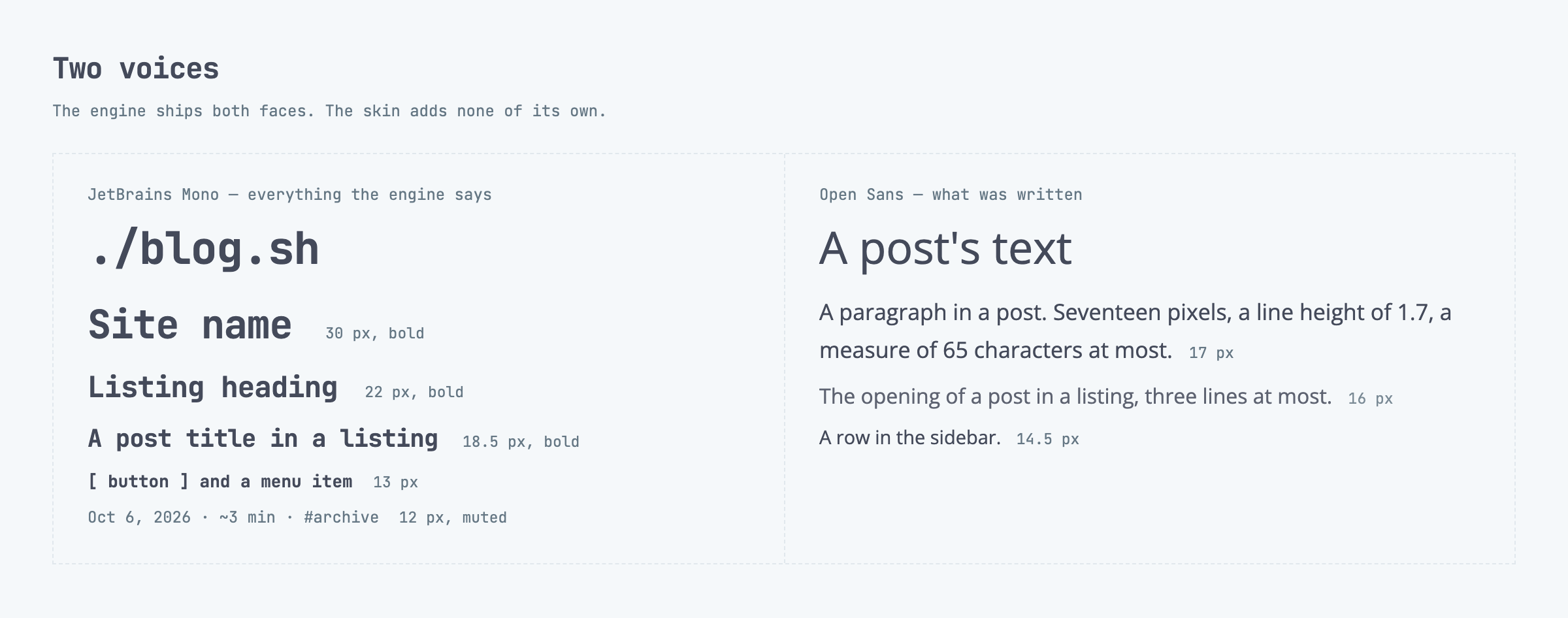
Two faces, both shipped by the engine, so the skin is one file and nothing extra is downloaded. They are the same two as in Minimal, with the work divided differently: there the monospace speaks for a page's name and for the engine, here for everything but the text.
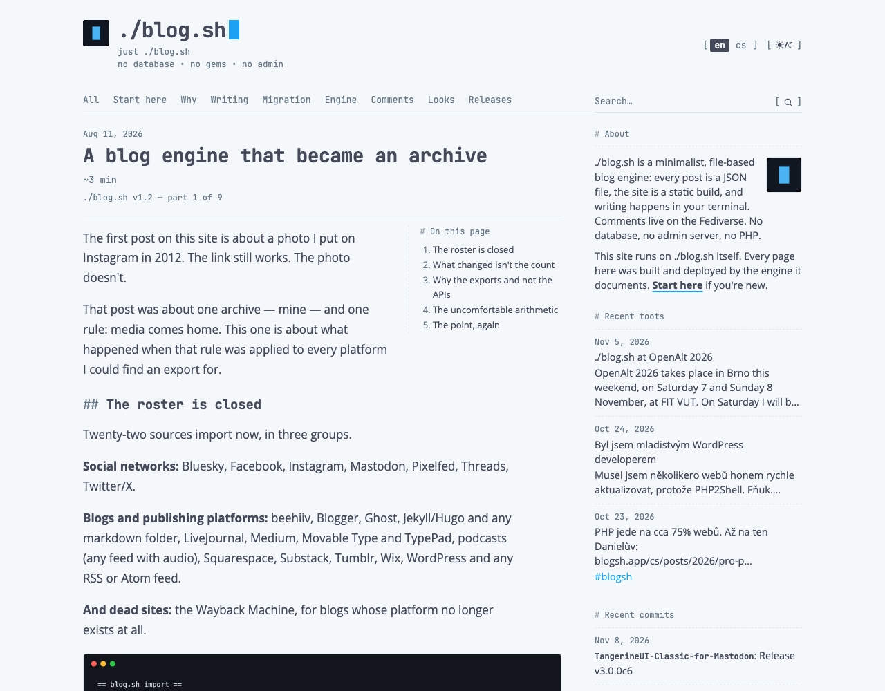
JetBrains Mono is the engine's voice. The site's name (30 px, bold), the heading of a listing (22 px), a post's title in a listing (18.5 px) and on its own page (23 to 28 px by the width of the window), menu items and buttons (13 px), the date, the reading time, counts and tags (12 px, muted). Titles are tracked by −0.02 em, so that a monospace at a larger size does not look thin.
Open Sans is what somebody wrote. A paragraph of a post is 17 px with a line height of 1.7, on a phone 16 px and 1.62. An opening in a listing is 16 px, a row in the sidebar 14.5 px. The measure is 65 characters at most; up to 860 px of width, where the sidebar folds under the text, a post's text runs as wide as its pictures.
The line between the voices is sharp and can be tested with one question: did a person write it, or did the engine work it out? A person wrote the title, but the engine sets it on the page as the name of a file, so it is monospace. The names of the speakers in a dialogue were written by a person and are part of the text, so they stay in the sans. I had that wrong for a while.
Shapes and marks
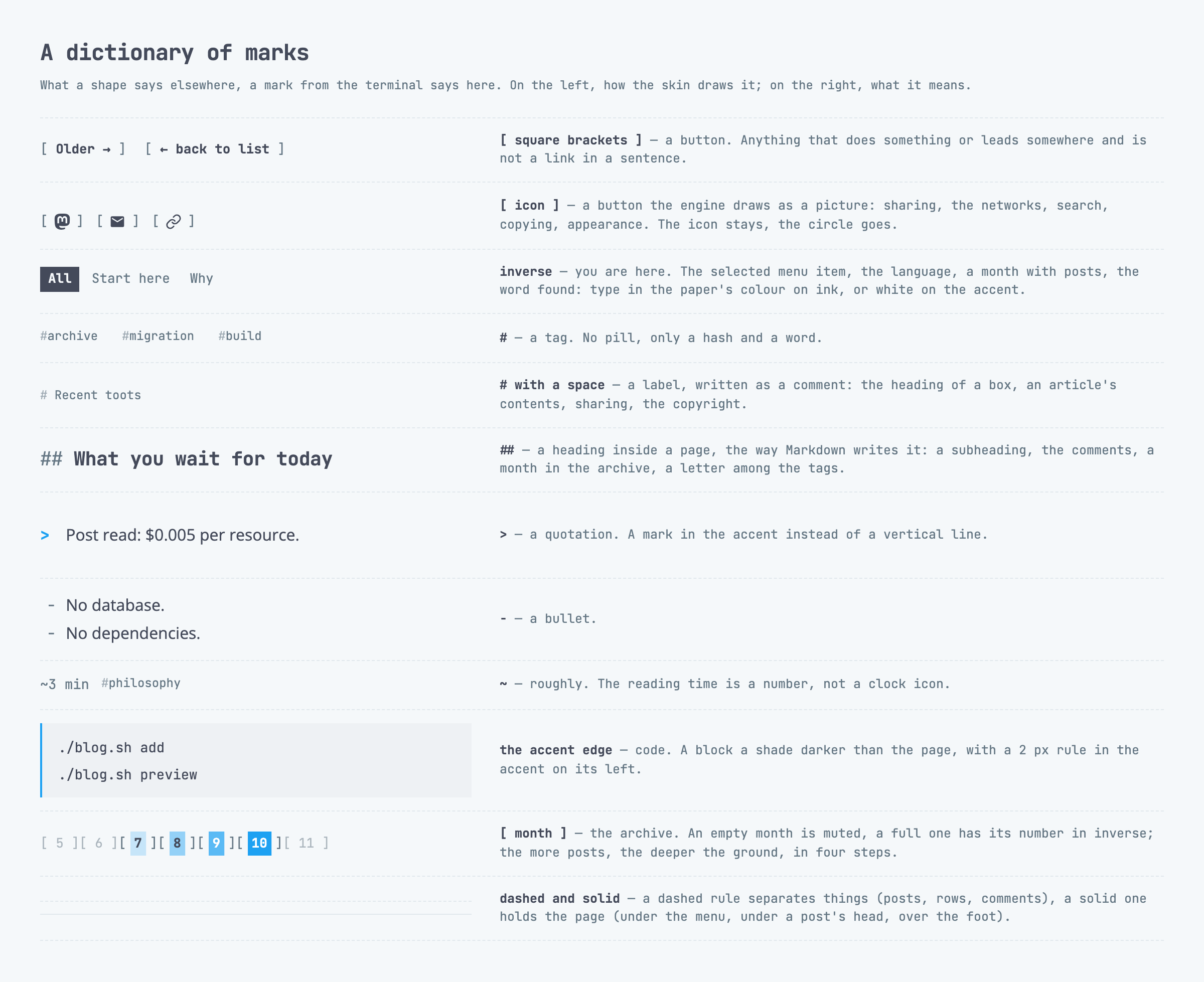
Minimal has pills, keys and cards with a corner of 14 px. Minimal Terminal has a corner of 3 px, and that is all that is left of shapes; the favicon, pictures and the avatars in comments have it. What a shape says elsewhere, a mark says here.
[ word ]is a button. Paging, the way to the next part of a series, the reply on Mastodon, the way back to the listing. Between the bracket and the word is a non-breaking space, so that a bracket is never left alone on the next line. It was once, which is how I know.[ icon ]is a button the engine draws as a picture: sharing, the networks in the foot, the magnifier, copying code, the arrow to the top, the appearance switch[ ☀/☾ ]and the language switch[ en cs ]. The icons are the engine's own, 16 px in sharing and the foot, 14 px elsewhere; they only lost their circle and gained brackets.#right before a word is a tag. No pill.#with a space is a label, written as a comment in a script: the heading of a box in the sidebar, an article's contents, sharing, the copyright.##is a heading inside a page, the way Markdown writes it: a subheading in the text (19 px), the comments, a month in the archive, a letter in the list of tags. The third level has###.>in the accent is a quotation, in place of a vertical line.-is a bullet.~is roughly: the reading time is~3 min, not a clock icon.
An attachment is [ pdf ] in a dashed frame, the only dashed frame on the site besides the examples on the Markdown cheat sheet. The title of a link post is not underlined, because all of it is the link and an underline would say nothing.
Inverse
The only fill the skin knows is the one a terminal knows: selected text. Type in the paper's colour on ink, or white on the accent. It always means the same thing, you are here, this is what you were looking for, or start here:
- the selected item of the menu,
- the selected language in the switch,
- a month of the archive that holds something,
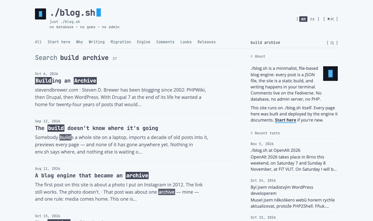
- the word found, in the results of a search,
- text you select with the pointer,
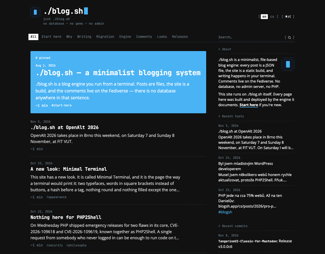
- the lead, the first post on the front page.
If the inverse were used for anything else, a button for instance, it would stop meaning a place. That is why a button is in brackets and not in a block.
Rules and air
Solid and dashed, both 1 px in the rule's colour, and never swapped.
Solid holds the page: under the menu, under a post's head, over the foot, under the search field. Dashed separates things of one kind: posts in a listing, rows of the sidebar, comments, years in the archive, results of a search, and the two blocks at the end of a post. A horizontal line the author writes into the text is dashed too.
There are no shadows. A card has neither edge nor ground; that something begins is told by a rule and by air.
Front page and listing
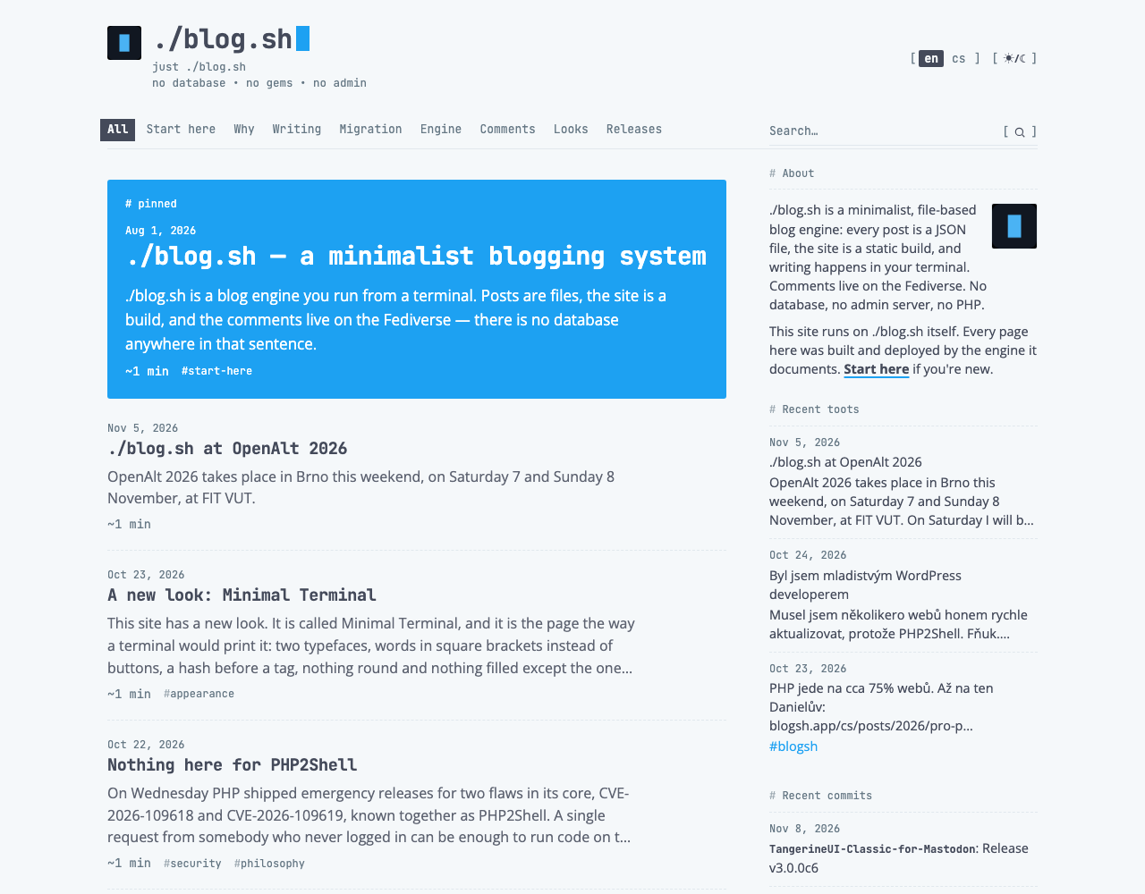
A post in a listing is four lines, one under another: the date, the title, an opening of three lines at most, and what the engine knows about the post, that is ~ with the reading time, the counts from the network and the tags with #. The date does not stand in a column beside the title but above it, and between posts there is a dashed rule.
The lead is the largest inverse on the site. The post the front page opens with stands whole on the accent, and everything in it is white, the date, the counts and the marks ~ and # included; on a ground this loud a second tone would only be a smudge. It is the pinned post, and where nothing is pinned, the newest. Which of the two it is, a comment above the date says: # pinned or # latest, on a Czech page # připnuto and # nejnovější. The title is up to 28 px instead of 18.5 (22 on a phone) and the opening may run to five lines instead of three. I tried quieter grounds too, the accent laid thin over the paper and the plate that code has. Both worked, but either would have been the first coloured surface that is not a selection. The full accent breaks no rule: the lead is simply the post that is selected. It holds on the front page only; the second page of the listing has none.
The post
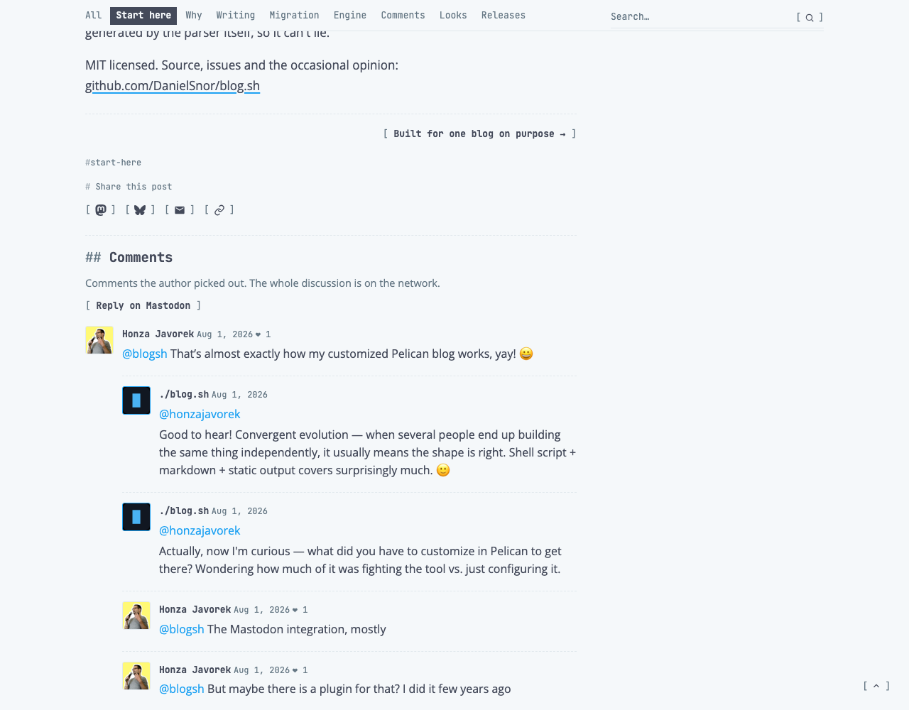
A post's page has the same order as a row of a listing, only larger: the date, the title in monospace (23 to 28 px by the width of the window), the engine's line, and under a solid rule the text. A longer post has the article's contents beside its opening, labelled after a hash and set off by a dashed rule. At the end come the button to the next part of a series, the tags and sharing under one dashed rule, and the comments under another.
The engine's pages
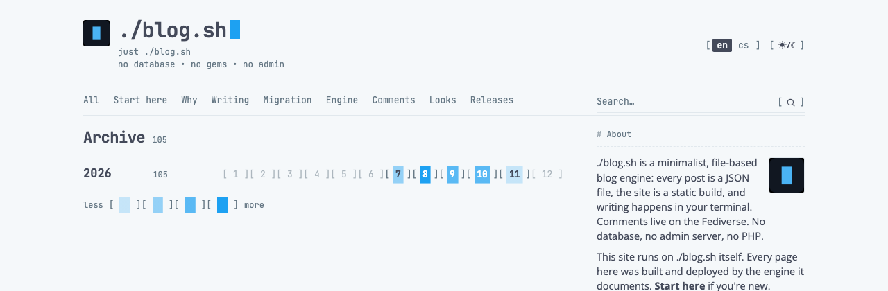
This is where the rule about not drawing data took longest to be born. The engine can draw the archive as a map of little squares by density, and the first version of the skin only recoloured it. It looked like something from another site. A bar chart fared the same. It ended with what a terminal would print: the year, and after it twelve months, [ 1 ][ 2 ] to [ 12 ].
An empty month is muted to 50 % and is not a link. A month with posts has its number in inverse, and the density is the depth of the ground in four steps: 22 %, 45 % and 72 % of the accent in the paper, and finally the accent whole. On the first two steps the number is in ink, on the other two in white. The ground lies under the number only; the brackets stay clear. The legend under the map is written the same way, less, then the four steps as samples two characters wide, [ ▒▒ ], and more.
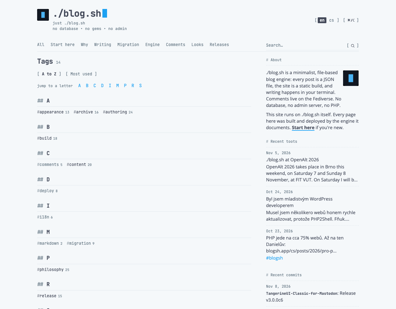
Tags are not a cloud. They are words with #, and how often a tag was used is told by the type: a tag with a single post is 11.5 px and does not even show its count, one with ten or more turns to ink, and one with a hundred or more is bold with its count in the accent.
Search is a field with a solid rule under it and a magnifier in brackets. The word found is in inverse in the results.
State and response
The response to a pointer comes in two forms. A control in brackets, from the appearance switch to the arrow to the top, turns to the accent under the pointer. A word that leads somewhere, that is a title, a tag or a link in the sidebar's text, gets an underline in the accent and keeps its colour. A row of the sidebar and a menu item under the pointer lie on the plate; a month of the archive under the pointer is selected in ink.
Focus from the keyboard is always an outline in the accent. The cursor after the site's name blinks every 1.1 s and stands still where motion is reduced. At night the favicon gets a hairline outline; otherwise day and night differ only in the colours the blog supplies.
Phone
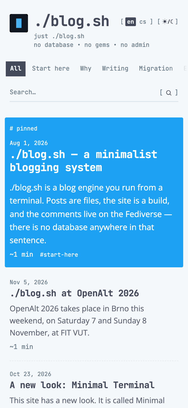
On a narrow screen nothing is redrawn, only stacked. Three things were worth a rule of their own.
The menu is, up to 860 px, one row that slides sideways. That it goes on is told by a fade at the edge, and on the side where there really is something: on the right at the start, on both in the middle, on the left at the end. The stylesheet knows the position; no script is needed for it. A browser that cannot tie an animation to scrolling fades the right edge only.
The site's name shrinks when it would run into the language and appearance switches. Between about 385 and 325 px it falls smoothly from 30 to 19 px. On a site with one language it only drops to 24 px at 360 px.
The archive has to fit the width of a phone with all twelve months, so the brackets stand close to the number and the ground is exactly under it.
The family
Minimal Terminal is one of the Minimal family of skins for ./blog.sh. The skins share four things: they read their colours from the blog's settings, they are one file, they touch no template, and their guides have these sections in this order (Manual adds one of its own). Terminal is the one variant not built on Minimal's file.
The kinship is in the discipline: few tones, one colour, a job for each face. Everything else is different.
| Minimal | Minimal Terminal | |
|---|---|---|
| A post's title | the sans | the monospace |
| Corners | 14 px, keys 8, pills round | 3 px |
| A button | a pill or a key | [ word ] |
| A filter and a link | a pill | a word, in inverse when selected |
| The accent carries | actions and what the engine knows | links, focus, the cursor, the edge of code, the lead |
| A card | a plate with a corner | nothing, only rules |
| The lead | the accent laid thin over the paper | inverse on the full accent |
| The archive | keys with a corner of 8 px | twelve brackets |
Checklist
Before I add anything to the skin, I go through these ten questions.
- Is it the engine's voice, or text? Monospace or sans accordingly. There is no third face.
- Does it have a corner larger than 3 px, a circle, a shadow or a filled surface? Then it is wrong.
- Is it a button? Then it has square brackets with a non-breaking space.
- Is it a tag, a label, or a subheading?
#,#,##. - Is a fill used as anything but an inverse selection? Then out with it.
- Can something be done with what is in the accent? If not, and it is not the edge of code, it should be muted.
- Does a rule separate things of one kind, or hold the page? Dashed, or solid.
- Is data being drawn here? Rewrite it as text.
- Is a colour written as a number anywhere but the white on the accent and the black behind a video? The skin may only read the site's five variables and mix from them.
- Does it fit 320 px without a scrollbar, by day and by night?
Changes
The skin comes with the engine from blog.sh 1.11, put on with site.skin: minimal-terminal, and it touches no template. When something in it changes, it changes here first.
11 October 2026: the lead arrived, the pinned post of the front page in inverse on the accent, and the guide was given the frame the whole family shares.
13 October 2026: the guide moved here, to the engine's own site. Minimal has meanwhile stopped being one site's coat and become the base of the family; the opening and the comparison with it were rewritten to match.
14 October 2026: one name for each thing across the family's guides; links to Minimal's guide and to the family.
16 October 2026: the skin comes with the engine from blog.sh 1.11, put on with site.skin: minimal-terminal; a video or a block of code that opens a card keeps to its column on a phone.
12 November 2026: brought up to date with blog.sh 1.11. The menu slides and fades up to 860 px; the name on a phone; the chapter you are in, a field in focus and a tag with a hundred posts in the accent; tags by ink and weight; the end of a post in two blocks; text to the edge of the column on a narrow screen; icons of 16 and 14 px. New pictures throughout.
Comments