Minimal Mobile: three voices and the blog's colours
./blog.sh is written in a terminal. Beside it there are apps: one for iPhone, iPad and Mac, one for Android, and one for Windows and Linux. They are optional, the engine can do everything without them, but once one is in your hand it should look like the blog you are writing to. The language they do that in is called Minimal Mobile.
It is a sibling of the Minimal skin: the same paper, ink and one colour, only translated from the web to touch. This guide says what is how and why, with the numbers read out of the code of the apps. At the end there are ten questions.
One sentence
Minimal Mobile is Minimal for a finger: the app wears the colours of the blog it has open, speaks in three typefaces, and the only fill on a screen is the thing that screen wants you to do.
Principles
- The colours are the blog's. The app reads them from its settings; open another blog and it recolours.
- Three voices of type. A screen's name, the content and the engine's voice; none stands in for another.
- The accent is an action or a value the engine knows. Every control, link and count; nothing else.
- What cannot be pressed fades whole and loses its fill; it is never merely made transparent.
- A warning is a word, not a surface. The second colour beside the accent belongs to what cannot be taken back.
Colours
The app reads five colours from the blog for the day and five for the night: paper, ink, muted, rule and accent. They are the very values the engine writes into the pages of the site, so the site and the app cannot drift apart except on purpose. A blog that says nothing about its colours gets the engine's default palette.
To those the app mixes two:
- the plate, the inside of a card, is ink at 3 % by day and 5 % by night,
- the faded tone is ink mixed with paper at 45 : 55.
And one is its own: the warning, #C62800 by day and #FF7A5C by night.
The settings offer three answers to whose colours the app wears: the blog's, its own (the engine's default palette, the same for every blog, for eyes a blog's palette does not serve) and those chosen on this device, colour by colour. Should the chosen ones stop being readable, the screen they are chosen on stays in the app's own colours, so there is always a way back.
The app's icon is a circle with a cursor; on an iPhone the cursor takes the accent of the open blog.
Type
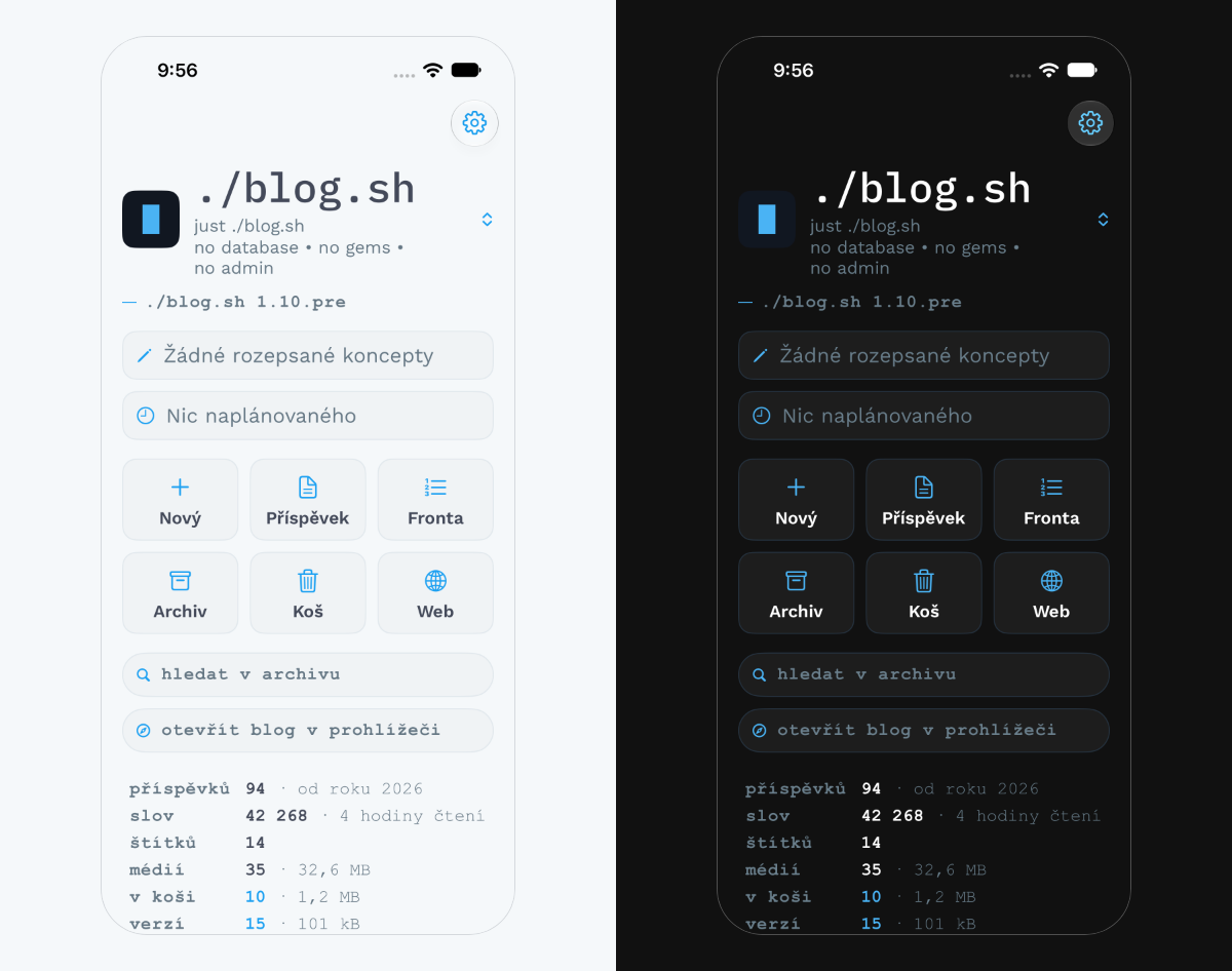
IBM Plex Mono Medium says what a screen is: the blog's name (34 points), a screen's name (29), the titles of actions (21). In lower case. The exception is German: it reads its nouns by their capitals, so the German app leaves the words as they are written.
Work Sans carries the content: rows and labels (15 points), smaller text (13), post titles.
A typewriter is the engine's voice: Courier New in bold, 12 points, tracked by 0.06 em, in lower case. A version, counts, dates, tags, the word on a key, the hint in a field. Android has no Courier New, so Courier Prime plays the part there; the rule is "Courier New, and where there is none, Courier Prime".
The app carries its faces with it. On the web, plain Minimal manages with the engine's two; the app has three, because on a small surface a screen's name and the engine's voice need to be told apart at a glance.
The size of the type is chosen on a key with five "Aa". The first is the system's size and the other four steps enlarge it; on a tablet the steps are longer, because it is read from further away. Gaps grow with the type: a gap that separates two groups at the usual size would be lost between lines twice as tall.
Shapes and marks
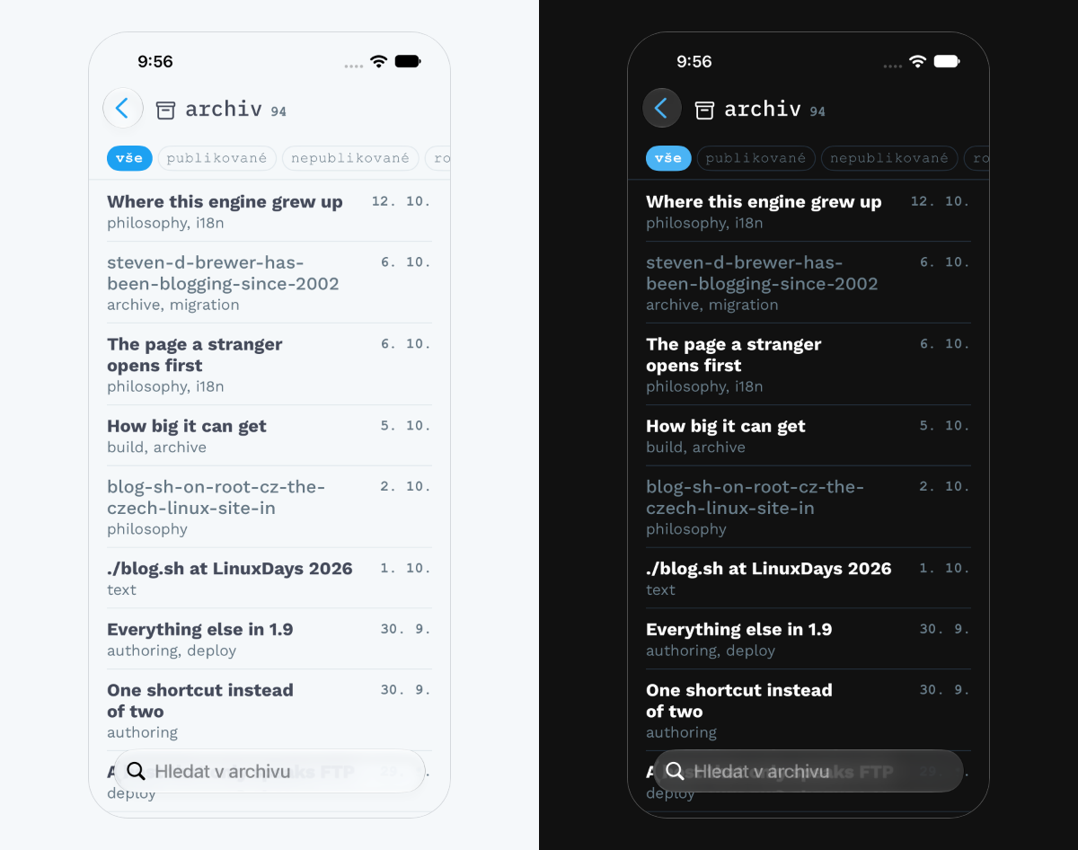
A card has corners of 14, a hairline and a plate; its inner margin is 13 points at the sides and 12 above and below. A card about the thing that is open right now has its outline in the accent and the accent at 12 % inside.
A pill is a filter: an outline in the hairline, and filled with the accent when selected.
A key has corners of 8: a square of 26 points with the sign of a command, the keys over the keyboard, the switches.
A count is a number in typewriter, 13 points, in ink.
The filled button is a capsule across the full width, lettered in white typewriter. There is at most one on a screen.
The gutter of a screen is 20 points. There are no shadows.
State and response
The response is pressing: a pressed thing turns 55 % opaque for a moment, a filled button 70 %. Where there is a pointer, on a Mac or a tablet with a mouse, a key under it gets its outline in the accent, as a pill does on the web.
Day and night follow the system, or the choice in the settings.
Out of reach
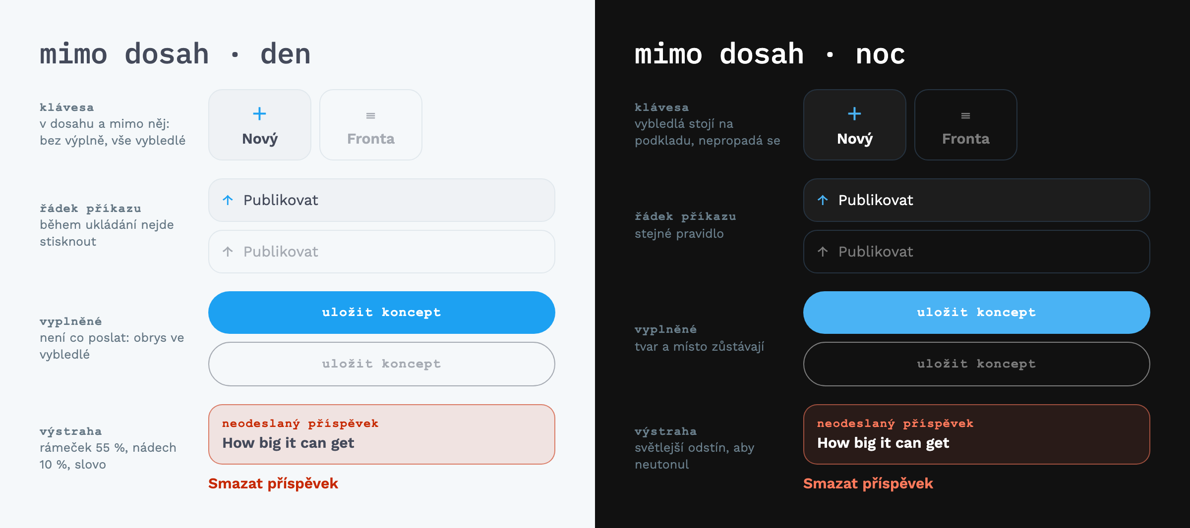
What cannot be pressed right now has a tone of its own, the faded. There are six rules:
- It applies to everything inside the element: icon, word and number alike. The accent and the warning both go; the accent means a key, and what cannot be pressed carries no accent.
- No fill, and the outline stays a hairline. The element keeps its place and its shape; it only goes quiet.
- No response: it does not answer to touch, to a pointer or to the keyboard, and a screen reader announces it as unavailable.
- Never by making the whole element transparent. That dims a fill, an outline and a picture each differently, and the result depends on what lies under the element. The mixed tone is the same on every palette.
- The order of tones is ink → muted → faded → rule. Faded is only for the short labels of unavailable keys, never for text meant to be read.
- Every row of a command that cannot be pressed right now wears the same, during a save for instance. It is the same state, so it has the same rule.
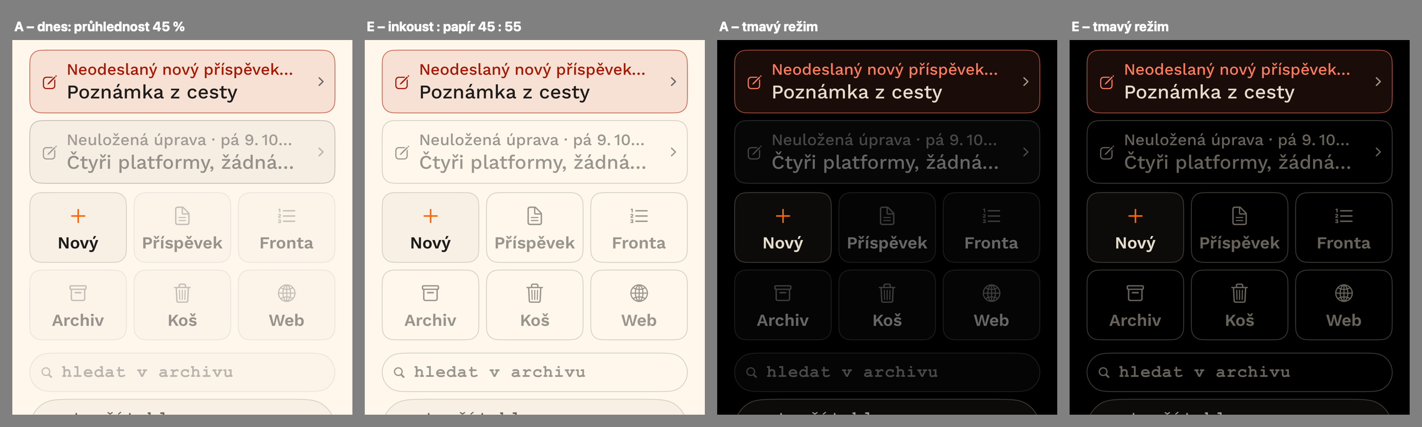
The tone is mixed, not made transparent, and the difference shows best on black: a transparent key sinks into the ground, a faded one stands on it. The rules were first written on sean.cz, when the apps still faded by transparency; the picture is from then, over sean.cz's palette.
The six rules first left out one case: the filled button with nothing to send. It used to fade to 35 % transparency, and since it is filled, the rule "no fill" did not fit it. It was decided like this: a filled button with nothing to send loses its fill and becomes an outline in the faded tone, the same shape in the same place. A fill in the accent says "this is what the screen wants"; when it wants nothing just now, it should not say so even faintly.
Warning
The warning belongs to what cannot be taken back: deleting, refusing. It is never a full fill, only a word, an icon or a thin frame; at most a tint of ten per cent under the frame of a card that warns, and that frame is at 55 %. The daytime shade was at first #A81800, but on sean.cz's paper it looked brown rather than red, and foreign beside the orange; the warmer #C62800 is of the same family as that accent and still plainly another colour. The "unsent post" card wears it as a frame and a heading; the title inside stays in ink. Among a post's actions the one that cannot be undone stands apart and last.
Phone and tablet
On a phone the app is a column of screens, one after another. On a wider screen the main menu stands on the left and the open screen beside it; the menu can be put away with a key in the accent. A tablet draws the first screen a little larger and steps the size of type in longer strides.
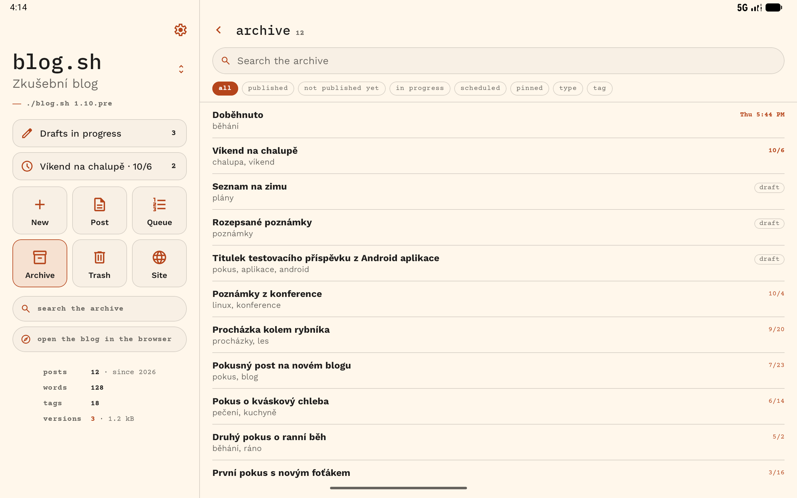
iPhone and Android
The apps agree on everything above and differ in one thing:
| iPhone, iPad, Mac | Android | |
|---|---|---|
| typewriter | Courier New | Courier Prime |
The app for Windows and Linux draws the Android app's tablet screens, its typewriter included.
The family
Minimal Mobile is not a skin but the Minimal family's language for the apps. It shares the main things with the skins: it reads its colours from the blog's settings, and the accent means an action or a value the engine knows.
| Minimal on the web | Minimal Mobile | |
|---|---|---|
| Typefaces | two, both the engine's | three, carried along |
| The engine's voice | JetBrains Mono, tracked 0.05 em | typewriter, 0.06 em |
| Plate at night | ink at 6 % | ink at 5 % |
| Rule | mixed out of the ink | taken from the blog's settings |
| Response | hovering: the accent | pressing: 55 % |
| Out of reach | none | the faded tone |
| Warning | none; the web deletes nothing | has one |
Checklist
- Does the screen wear the colours of the open blog, unless the user chose otherwise?
- Is the only thing in the accent what can be pressed, what is selected, or what the engine knows?
- Does each of the three voices speak only for itself?
- Is there at most one filled button on the screen?
- Do cards have corners of 14 and keys 8, and does nothing have a shadow?
- Is whatever cannot be pressed faded with the mixed tone, with no fill, no accent and no transparency?
- Is the warning a word, last and apart, and never a full fill?
- Do the gaps grow with the type?
- Do the apps keep to the same numbers, the typewriter aside?
- Is there a way back from every choice of colours?
Changes
13 October 2026: the first edition.
14 October 2026: one name for each thing across the family's guides; links to Minimal's guide and to the family. The reasoning behind the faded tone, the filled button and the warning's shade came here from the sean.cz manual, with its picture.
15 November 2026: three apps instead of two: the iPhone app is one for iPhone, iPad and Mac, and the app for Windows and Linux wears the Android app's screens; a link to what the apps do.
Comments