Minimal Manual: chapters, sections and numbers
./blog.sh v1.11 — part 10 of 12
Minimal is built for a blog: the newest on top, a post reached from a listing, and on you go when you have read it. A manual is not read; a manual is looked things up in. You want to know where you are, what is around you and how to get one chapter over. Minimal Manual is the variant for sites that hold documentation. In it, the page is a handbook.
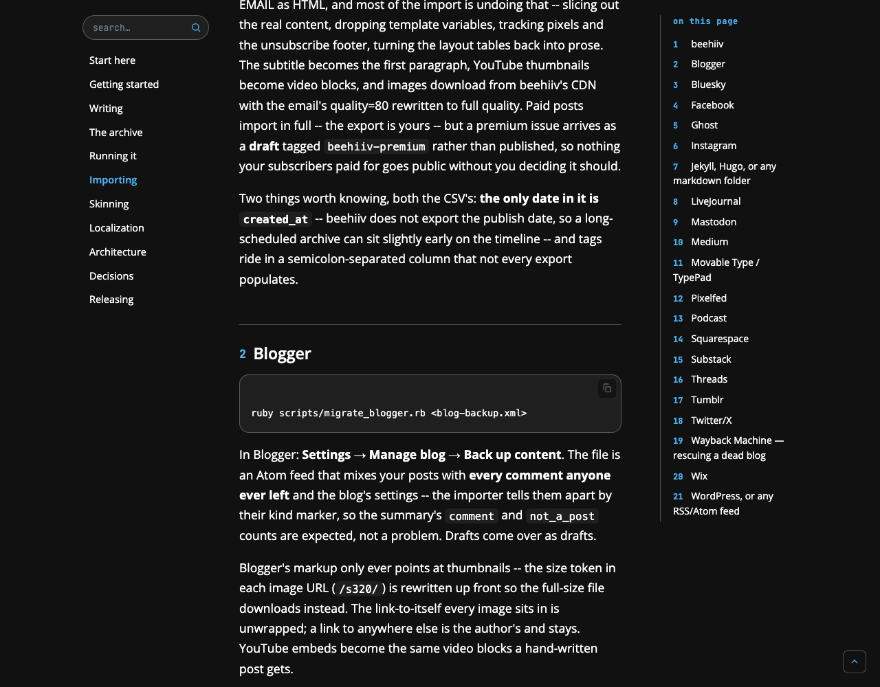
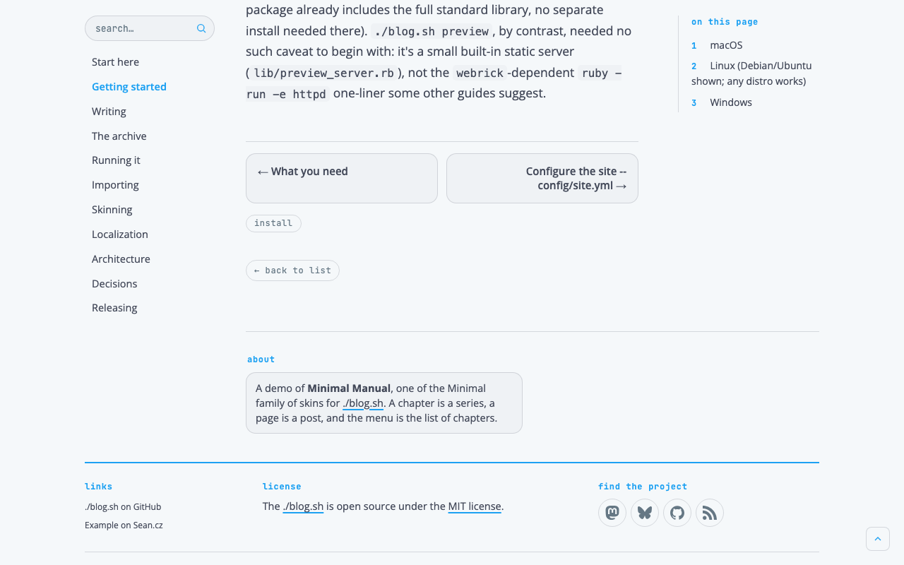
This text is a guide, not a story: what is how and why, with the numbers read out of the file. Whatever is not here is the same as in Minimal and is in its guide. The pictures are of a copy of the live example, ./blog.sh manual, the engine's own documentation set in this skin, in the engine's default palette. If you would rather not read all of it, there are ten questions at the end.
One sentence
Minimal Manual is a handbook: the chapters on the left, in the middle a page with numbered sections, and on the right its contents, which stay in sight. It is a skin for sites on ./blog.sh, of the Minimal family, and it takes its colours from the site it runs on. From blog.sh 1.11 it comes with the engine: site.skin: minimal-manual in config/site.yml puts it on, as does ./style.sh under Layout, and ./blog.sh rebuild then applies it. This guide describes it as of 1.11.1, which evened out its last edges.
Principles
Five sentences in which it differs from Minimal. Minimal's own five still hold.
- A chapter is a series, a page is a post. A manual is built from what the engine already knows.
- The reader always sees where they are. The chapters on the left and the contents on the right stay on the screen.
- The stylesheet numbers the sections. A heading in the text and its line in the contents carry the same number.
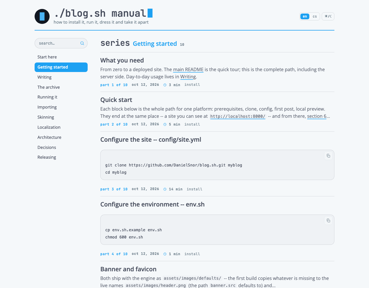
- A listing is a table of contents. A title, two lines of what it is about, and which part it is.
- The accent on a page is a section's number and the chapter that is open. Headings are in the ink, the date muted.
How a manual is built
Manual brings in nothing the engine does not know. It only calls things by other names.
| In a manual | In ./blog.sh |
|---|---|
| a chapter | a series |
| a page | a post, a part of a series |
| a chapter's contents | the series' listing |
| the menu of chapters | nav: in the site's settings |
| a section | a heading inside a post |
| a note | a quotation |
The site writes its own menu of chapters, under nav:: a label, and with it a series by its name (series:), the address of a page, or a tag. A heading over several chapters is an entry of its own: a label with group: true, holding the chapters under it up to the next heading. ./style.sh offers it, and ./blog.sh doctor says so when an entry stops pointing at anything. The order of pages in a chapter is the order of the series' parts. The order of the chapters in the menu is the order you write them in. The list of series is the engine's: the series with the newest page first, or, with order: oldest under series_index:, the series begun first. So date the chapters in reading order and set order: oldest.
layout.series_contents: true lists every part of a chapter on each of its pages, under the line over the title, and series_index: gives the list of series a name of its own, such as title: Chapters.
Colours
Unchanged. Paper, ink, muted and the accent are read from the site's colors:; the rule and the plate are mixed from them in the same proportions as in Minimal.
Two things changed colour. Headings are in the ink; the accent on them is carried by their number alone. And a page's date is muted: in a manual it says when the page was written, not what it is.
Type
The engine's two faces and three voices, as in Minimal.
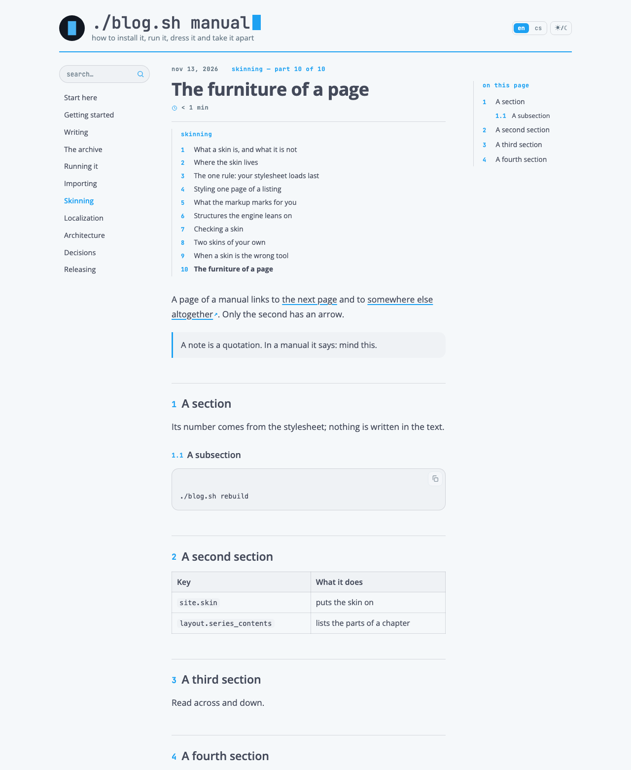
A section's number is the engine's voice: JetBrains Mono, bold, in the accent, 0.72 of the heading's size, before the heading. A section of the second level has "1", of the third "1.1". Use only these two levels on a page: a heading of any other level has no number in the text, yet counts in the contents.
A section's heading is Open Sans in the ink, the second level at 1.45 rem, the third at 1.12 rem.
A chapter in the menu is Open Sans at 14.5 px, as it is written. In Minimal a menu entry is a pill, in the monospace and in lower case; in an upright list of chapters' names, pills of differing widths would make no sense.
Shapes and marks
The pill, the key, the card and the filled button are Minimal's. Manual adds six things.
A chapter's row in the menu has a corner of 8 px. At rest it is only a name; under the cursor it stands on a plate; and the open chapter is filled with the accent, lettered in white.
A group of chapters has its heading over them in the voice the family labels things in: the monospace, small, bold, in lower case and muted, with air above it. Under 1100 px it is Minimal's quiet caption beside the pills.
A note is a quotation: a plate with a 3 px rule in the accent down its left edge and a corner of 14 px on the right. The engine has one way of setting words apart from a text, and in a manual it is used to say "mind this".
A link out has a small arrow in the accent after it. In a manual it matters whether a link leads to the next page or somewhere else altogether. The stylesheet tells by the address: a link written with its protocol leads out, one written from the root stays.
A table takes the full width of the column and is ruled in full hairlines; in a manual it is read across and down.
A card for the way on stands twice at the foot of a page: the page before on the left, the page after on the right, each across half the column, on a plate with a hairline.
Rules and air
From 1100 px of width a page has three columns: the menu of chapters at 184 px, the text at 556 px and the contents at 200 px. Between the menu and the text there are 44 px, between the text and the contents 56 px. The whole keeps 1080 px with its gutters, as everywhere in the family.
The line in the accent that Minimal draws under its menu is here under the head, across the whole page. It frames the page from above just the same; only the menu no longer stands in a row under it but in a column.
A section of the second level opens under a hairline, with air of 2.2 times the heading's size over it: where a section begins should be found at a glance.
A page's text runs to the right edge of its column, to the same edge as the pictures, the tables and the code.
What Minimal keeps beside the content (about the site, the latest from the networks) stands under it, two cards across. Beside a manual's text there is room for two things, and both are navigation.
Front page and listing
A listing is a table of contents: rows are closer together than in Minimal (14 px above and below instead of 20) and an excerpt is two lines instead of three. The date has no column of its own: it stands in the line of facts under the excerpt, as in Minimal Literal. On a chapter's contents "part 3 of 22" comes before it.
A series' listing is a chapter's contents, and on it the chapter is the open one in the menu. On each of its parts its row is in the accent and bold: you are in the chapter, not on its contents.
The lead is Minimal's, unchanged. In a manual a pinned post is a natural "start here".
The post
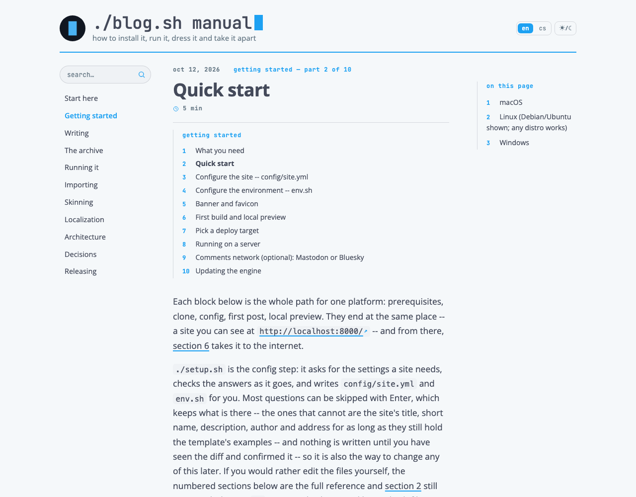
A post with sections is a page of the manual. The engine gives a page its contents from four headings up, unless the post says otherwise with toc:; a page without them runs its text to the edge of its column all the same.
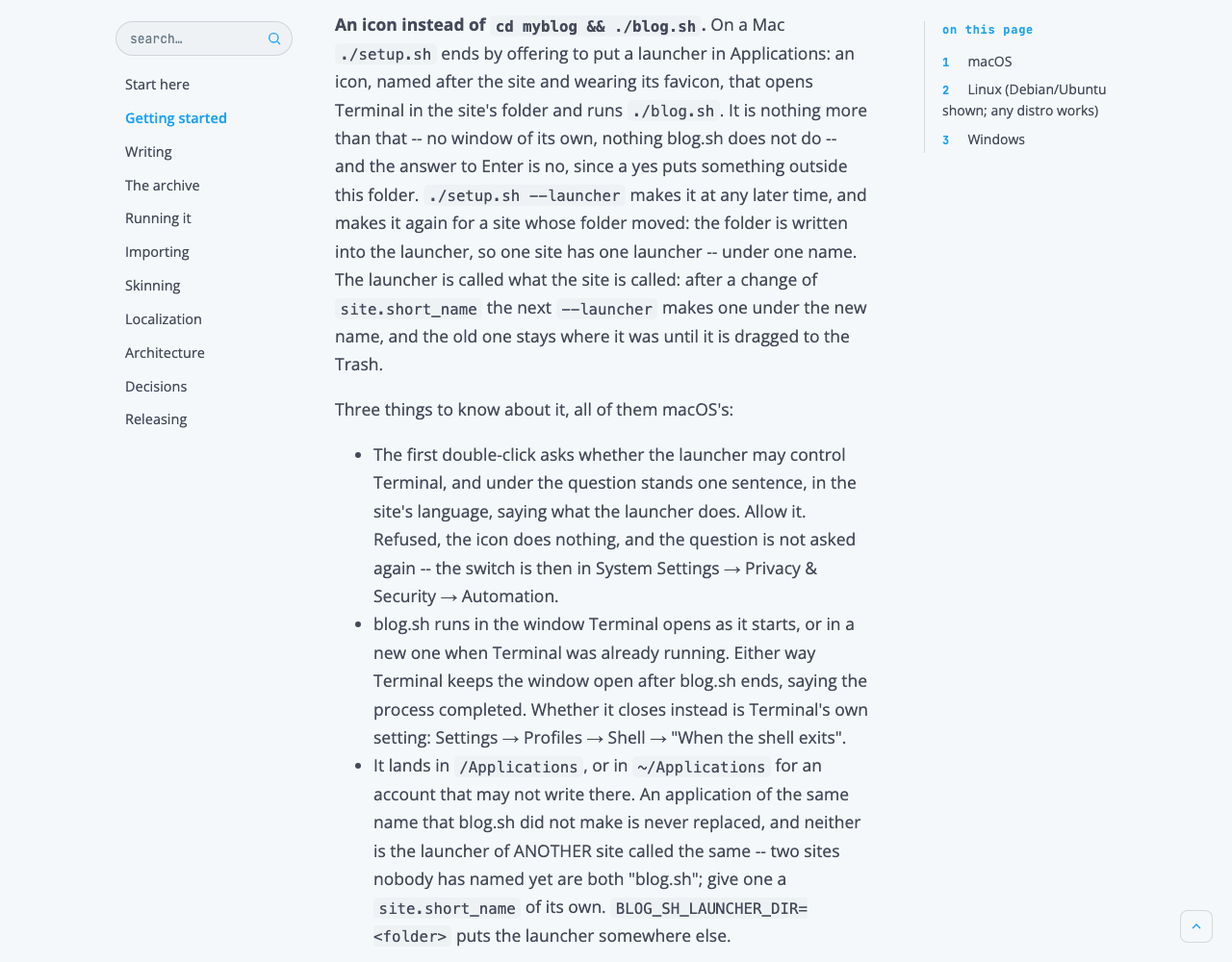
The contents (the engine's "on this page") stand to the right of the text, with no card, only a hairline on the left, and stay 22 px under the top of the window while the page scrolls. Their lines carry the same numbers as the headings in the text; a subsection is set in and smaller.
A heading that is jumped to stops under the top of the window, not behind it.
The line over the title says where in the manual you are: the date, muted, and beside it "the series' name — part 21 of 22" in the accent, a link back to the chapter's contents.
At the foot of a page are the two cards for the way on, and under them the tags, sharing and the comments, as in Minimal.
The engine's pages
The archive, the list of tags, the list of series, search and the page that is not there are Minimal's. On a wide screen they stand beside the menu of chapters and have the sidebar under them. The list of series is, in a manual, the list of all chapters: the stylesheet numbers them as it numbers sections, the number in the accent and the name in the ink, and the years a series ran, which say nothing about a chapter, are not shown. The numbers follow the manual's order when the list runs with order: oldest; see How a manual is built.
State and response
Hovering, focus, the blinking cursor, pictures dimmed by night and noughts that are not shown are Minimal's. A chapter in the menu gets a plate and its text in the accent under the cursor; a card for the way on gets its outline and text in the accent.
The menu is lit in two ways. On a series' listing the chapter is filled with the accent; on each of its parts its row is in the accent and bold, because you are in the chapter, not on its contents. The menu is a flat list in the settings; group: true puts headings over it, and nothing nests deeper than that.
Phone
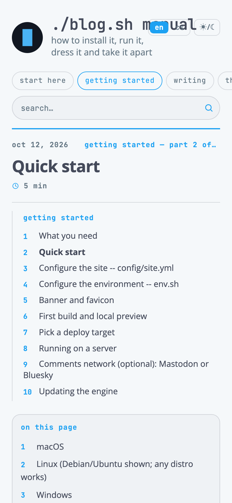
Under 1100 px of width the menu is Minimal's row of pills under the head, and the line in the accent is under it again. Between 901 and 1099 px a page has two columns: the text at up to 700 px and the contents at 250 px, which stay 86 px under the top of the window, under the menu.
From 701 to 900 px the contents are Minimal's card floating beside the opening; up to 700 px they are a block over the text, as in Minimal. The sidebar goes under the content at 860 px. On a phone the cards for the way on stand one under the other.
The numbering of sections, the note, the arrow on a link out and the ruled table are the same at every width.
The family
Minimal Manual is one of the Minimal family of skins for ./blog.sh, which stands on Minimal, Terminal on classic. The skins share four things: they read their colours from the blog's settings, they are one file, they touch no template, and their guides have these sections in this order, with one section added here: how a manual is built. What Minimal can already do, a variant inherits unchanged; the table says what this one does otherwise.
| Minimal | Minimal Manual | |
|---|---|---|
| The menu | a row of pills under the head | a column of chapters on the left, staying in place |
| The contents | a card, floating beside the opening | a column on the right, staying in place |
| Sections | headings in the accent | numbered, in the ink, under a rule |
| A quotation | a rule in the accent on the left | a note on a plate |
| A link out | like any other | with an arrow |
| The way between parts | two pills | two cards across the text |
| A post's date | in the accent | muted |
| A row of a listing | three lines of an excerpt | two lines, the part of the series first |
| The date in a listing | a column of its own on the left | in the line of facts, as in Minimal Literal |
| The list of series | names in the accent, with years | numbered chapters in the ink, without years |
| The sidebar | beside the content | under the content from 1100 px |
Checklist
Ten questions before anything is added to the skin. If any of them comes out no, it is not Minimal Manual.
- On a wide screen, does the reader always see the chapters and the contents, wherever in the text they are?
- Does a section in the text carry the same number as its line in the contents?
- Does the stylesheet do the numbering, with no number written in the text?
- Are headings in the ink, and only their number in the accent?
- Is the open chapter filled with the accent, and is it the only one that is?
- Can a link out be told from a link to the next page of the manual?
- Does a page's text run to the right edge of the column, where the pictures and tables end?
- Is it plain at the foot of a page what comes before it and what after?
- Under 1100 px, can everything still be reached, only one thing under another?
- Does the skin carry only itself: no font, no script, no touching a template?
Changes
13 October 2026: the first edition.
14 October 2026: the date in a listing as in Minimal Literal; numbered chapters in the list of series; a live example; terms the same as in the rest of the family.
16 October 2026: the skin comes with the engine from blog.sh 1.11, put on with site.skin: minimal-manual; groups of chapters in the menu (group: true), and on a part of a chapter its row in the accent.
15 November 2026: brought up to date with blog.sh 1.11.1. The card to the next page fills its half and every page runs its text to its column's edge, a picture or a video in it included; the menu's order as written and order: oldest for the list of series; series_contents; the lit chapter on a page; the widths between 701 and 1099 px. New pictures, of a copy of the live example.
Comments